
John Singer Sargent's Watercolors
I get to see so many great works of art by artists I truly admire, that I like to share them with as many folks as I can. As I’ve probably already blah-blahed, I’m a big fan of the watercolors of John Singer Sargent. As a matter of fact— as a failed watercolor artist—I sort of idolize Sargent’s watercolors.
They just make me feel happy all over looking at the many, many beautiful works he produced in that medium. Here are some I bet you may never have seen. And please note: at the same time Sargent was producing gorgeous watercolors, he was till painting in oils, though hardly any portraits, except for one that was commissioned for the Ufizzi in 1907.
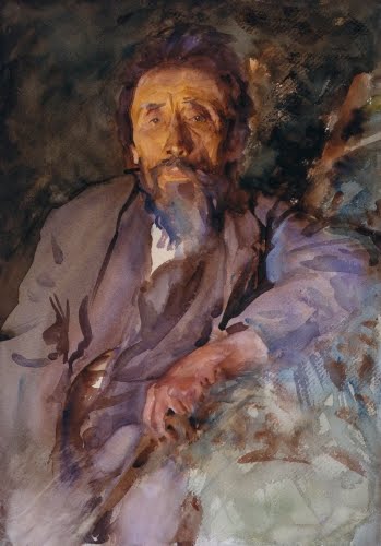 |
| John Singer Sargent (1856–1925), A Tramp, ca. 1906. Watercolor on paper, 20" x 14" (50.8 x 35.6 cm). © Brooklyn Museum. (BMA-1010) |
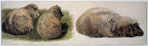 |
| John Henry Leonard (1834-1904, Britain), Studies of Sheep. Watercolor on paper, 4 3/8" x 14 3/16" (11 x 36 cm). Private Collection. © 2016 Davis Art Images. (8S-13169) |
The Impressionists really laid the groundwork for Sargent’s watercolor when they revolutionized the painting process. Sargent himself painted in Giverny with the Great One, Claude Monet (1840–1926). Impressionists discarded the traditional, academically-taught underpainting that established lights and darks in favor of applying pure color right to the white surface of the canvas. This made their colors RADIANT.
There are a lot of reasons I attribute Impressionism for Sargent’s late works, particularly in watercolor. Compare the Sargent above (I really hate that title) with the Leonard. Did you know Sargent was a master of the “schmear” (my word)? To lessen the saturation of a color he would rub off with his fingers or a brush the wet watercolor, allowing the paper to help create a tint. Academic artists like Leonard used the traditional brown-yellow-green underpainting and achieved tints for highlights by adding white (gouache) to the color of the fur.
It’s amazing to me how luminous this little study is, with the schmeared cobalt blue coming through in the highlights on the arm. And that incredible muted shadow of the left ear Sargent achieved! This piece may come from Sargent’s 1905 to 1906 trip through the eastern Mediterranean from Palestine and the Middle East through Turkey to North Africa.
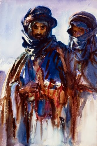 |
| John Singer Sargent, Bedouins, ca. 1905. Watercolor on off-white wove paper, 17 7/8" x 12" (45.4 x 30.5 cm). © Brooklyn Museum. (BMA-1012) |
So many of Sargent’s watercolors are like tourist snapshots of his travels through the Middle East and Europe. Let’s just say I prefer watercolors to photographs if I have my choice when Sargent’s work is concerned. This work is stunning, not because of the intense expression on the man’s face, but the fact of the luscious cobalt blue deep shadows. Perhaps the fact that Sargent was able to capture the essence of his subject with quickly executed watercolor accounts for the fact that there is little interest in psychological depth in this piece?
This Bedouins comes from the same trip as A Tramp. I can only guess that Sargent saw these guys either in Syria or Saudi Arabia? For works like this Sargent usually did the most minimal pencil sketches, and then constructed the form in color.
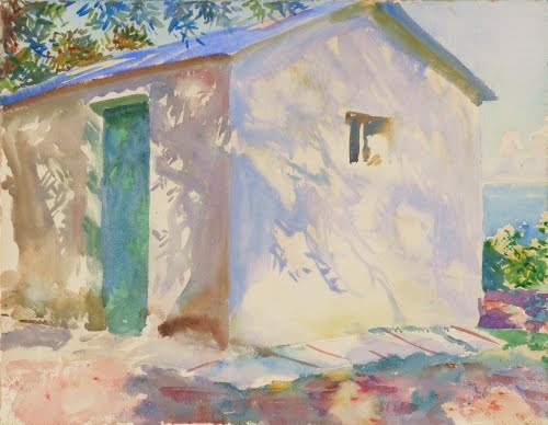 |
| John Singer Sargent, Corfu: Lights and Shadows, 1909. Transparent and opaque watercolor over graphite, with wax resist on paper, 15 7/8" x 20 7/8" (40.3 x 53 cm). © MFA, Boston. (MFAB-41) |
Between 1907 and 1909 Sargent must have traveled constantly, because he produced watercolors from Switzerland, Italy, and Greece. Corfu is an island on the west side of Greece. The island must really have inspired Sargent, because there are a lot of gorgeous paintings that resulted from that visit. This watercolor is my favorite. Talk about the ability to evoke the physical sense of a sunny day in the Mediterranean!
This depiction of shadows on a whitewashed wall is simply brilliant. I’m thinking that he achieved the white parts of the wall by blocking them with either a candle or wax crayon. That means he established the shadows in reverse, I am assuming. I’m just wondering how thick he applied wax and if it stayed on the work after finish?
At any rate, this is a gorgeous little work, especially those scrumptious shadows of multiple color in the foreground. That was yet another realization that was arrived at by the Impressionists, that shadows have color, they’re not black. Before Impressionism, shadows were achieved by adding black (or burnt sienna) to the local color to create a shade.
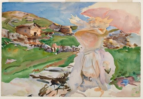 |
| John Singer Sargent, In the Simplon Pass, 1909. Transparent and opaque watercolors over wax resist and graphite on paper, 14 7/16" x 21 3/16" (36.7 x 53.8 cm). © Brooklyn Museum. (BMA-5292) |
I absolutely love Sargent’s sun-drenched watercolors of Switzerland! I’m including this piece because it isn’t quite finished, but it is gorgeous anyway. One can actually imagine the finished piece in one’s mind due to the absolutely brilliant colors Sargent uses in the shadows. I’m thinking he used the wax resist in the top of the parasol and details of the sitter’s outfit.
Sargent had only two exhibitions of his watercolors in the US at the Knoedler Gallery in New York. In 1909 exhibition, the Brooklyn Museum bought the whole group which Sargent considered a cohesive portfolio. In 1912 the MFA in Boston did the same thing at the second exhibition. Sargent remarked that he really liked painting in watercolor, and I think it shows! Now if I can only figure out exactly how he applied the wax resist: Was it like frisket? A stick of wax? Stumped minds want to know!
See my post from 2008 for another Sargent watercolor.
Correlations to Davis programs: Explorations in Art 2 1.3-4 studio; Explorations in Art 3 5.27-28 studio; Explorations in Art 4 1.1; Explorations in Art 5 1.1, 1.2, 1.5, 4.20; Explorations in Art 6 1.3; A Community Connection 2.3, 6.4; A Personal Journey 2.2; Experience Painting 2, 5; Exploring Painting 5; Exploring Visual Design 3; The Visual Experience 9.3, 9.10, 16.6; Discovering Art History 15.1
Comments