World Watercolor Month
July is World Watercolor Month. I’m always happy to celebrate a medium in which I am really not terribly good. I have a feeling it’s because I’m an impatient Virgo who can’t stand to patiently build up translucent layers of color as one ought to do.
When I was first in grad school in painting courses, I was using watercolors and gouache. My teacher said, “you’re trying to do in watercolor what you should be doing in oils.” So, there you have it, I’m not a watercolorist. But let’s celebrate the art of those who are accomplished.
Watercolor has been an art medium since cave paintings, when natural elements were mixed with water to make paints. For centuries artists made their own watercolors by grinding natural ingredients such as ochre, ashes, and various plants and mixing it with water. In the early Renaissance (ca. 1400–1600) watercolor was often only used to tint woodcuts or other prints. Albrecht Dürer (1471–1528) is credited with creating highly finished watercolors of animal and plant studies that advanced the medium toward finished fine art status.
British landscape artists of the 1700s are credited with advancing stand-alone-watercolors-to-fine-art status. By the period of Impressionism (ca. 1870s–1890s), watercolors had arrived as works of art in their own right. Many painters in oil held exhibitions of just their watercolors for the first time around the turn of the 1900s.
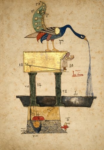 |
| Egypt, A Peacock Basin, leaf from a dispersed Automata manuscript Treatise on Ingenious Mechanical Devices, by al-Jazari, probably from Cairo, 1354. Opaque watercolor, gold leaf and ink on paper, 13 3/4" x 8 1/4" (35 x 21 cm). © Museum of Fine Arts, Boston. (MFAB-1381) |
I’m guessing this device does not use a live peacock as a spout, but this illustration does not indicate how the water gets from the reservoir into the bird. The written word has always been important in cultures of Islamic faith, to the point where writing (calligraphy) is an art form. From the middle Islamic period (ca. 750–1200) on, therefore, book illustration was an important art form. Every kind of book was illustrated except the Qur’an. In Arab lands, the favored medium for book illumination was opaque watercolor.
Manuscripts dealing with automata—mechanical devices that usually incorporated moving figures—were immensely popular in both Europe (in the Middle Ages ca. 1000–1400) and the Arab world. The Turkish scientist, engineer, and mathematician Ismail al-Jazari (1136–1206) made many advances in the field of automata devices. He is thought to have created some remarkable automatons, including a clock shaped like an elephant with a puppet striking a bell for the hour. Al-Jazari’s devices were usually powered by water that turned a cam shaft. I don’t really know where that is in this design, but this fountain/basin would certainly be a conversation starter at a party.
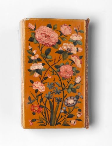 |
| Iran, Cover of a prayerbook that contains passages from the Qur’an, 1729. Ink opaque watercolor and gold leaf on paper mounted to lacquered pasteboard, 3 11/16" x 2 1/4" x 3/4" (9.4 x 5.7 x 1.9 cm). © Brooklyn Museum (BMA-2249) |
If I owned a beautifully illustrated book like this, I’m sure I wouldn’t carry it around for fear of somehow damaging the work of art that is its cover! The Safavid dynasty in Iran, which ruled from around 1526 to the mid 1700s, is considered one of the periods when art really flourished, particularly architecture, ceramics, textiles, metalwork, and book illustration. Iran under the Safavids grew prosperous because of their strategic location on the trade routes between India and China with Europe.
Contact with Europe brought Safavid artists in contact with European art. Safavid rulers encouraged European artists to relocate to the Safavid court. Floral decoration is a mainstay in mosque, textile, and mausoleum decoration, usually in an abstracted style. This realistic floral painting is possibly indicative of the influence of European botanical studies of the Renaissance and Baroque periods.
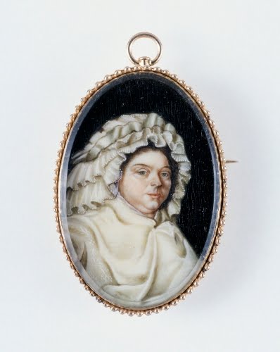 |
| American, Miniature of Elizabeth Sewell Salisbury, 1787–1789. Watercolor on ivory, 1 1/2" x 1" (3.8 x 2.5 cm). © Worcester Art Museum, Worcester, MA. (WAM-648) |
Watercolor is such a mystery to me technically anyway, but I really can’t figure out how artists got it to stay on a piece of ivory. They must have scored it somehow to make the surface porous? However they did it, watercolor-painted ivory miniatures are one of the most fascinating forms of portraiture ever! They flourished between the 1500s and mid-1800s, when the Daguerreotype photographic portrait more or less killed the genre. Miniatures were meant to be keepsakes of either a loved one far away or of a departed loved one. They were either worn or displayed on a small stand.
Portrait miniatures were madly popular in the American colonies and the early Federal period. Like all other forms of art, they were status symbols. Many prominent portrait miniaturists were women artists. This miniature is an exact copy of a painted portrait in oil of a member of one of the wealthy Salisbury family of Worcester, MA, big supporters of the American Revolution (1775–1783). The original oil was painted by Christian Gullager (1759–1826), a popular society portraitist of the post-Revolution period. Gullager even painted a portrait of President Washington.
I personally love her dormeuse, the demure confection of ruffles on her head. Until the middle of the 1800s, it was typical for married women to have a covered head both at home and in public. The dormouse was a French invention originally fashioned to protect the ridiculously elaborate hairdos of pre-Revolution France during sleep. Hence the noun extracted from the verb dormir, to sleep.
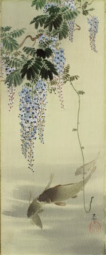 |
| Ohara Koson (1877–1945, Japan), Carp and Wisteria. Ink and watercolor on silk, 15 15/16" x 6 9/16" (40.5 x 16.7 cm). © Museum of Fine Arts, Boston. (MFAB-1041) |
Among watercolor artists of whom I am in awe are Japanese painters. Their masterful layering of transparent watercolors and ink make me drool. This masterpiece just makes me want to take up watercolor again, but then I always have to remind myself, “remember what your watercolors looked like!” Certainly not as sophisticated as this!
Ohara Koson was active in that fertile, and yet turbulent, period of the Meiji Restoration (1868–1912) when Japan rapidly industrialized and drank up the influence of Western art. Japanese artists formed two “camps” in the printmaking genre: the shin hanga (new prints) and sosaku hanga (creative prints). The shin hanga artists believed in doing things the old fashioned way with both subject matter and process, while the sosaku hanga preferred total control over their work. Ohara was part of the conservative shin hanga. While he is known mostly for his prints, his paintings are really stunning.
Shin hanga artists preferred subject matter, as well as style, that was traditional. That may be the case, but this painting has a dose of Western realism in it, along with typical features of Japanese painting: asymmetrical balance, expert contrast of positive and negative space, and open composition.
Check out this post from May for more shin hanga and sosaku hanga art.
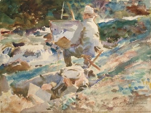 |
| John Singer Sargent (1856–1925, US), An Artist at His Easel, 1914. Watercolor over graphite on wove paper, 15 3/4" x 24 15/16" (40 x 53.4 cm). © Art Institute of Chicago. (AIC-347) |
One of my favorite American artists, Sargent, was one of the key forces in changing watercolor from study medium to out-and-out finished fine art in America. In the early 1900s, many museums had subscriptions with him to buy a certain number of watercolors per year, they were so prized. Most know him only as a portrait painter of wealthy American ex-pats in Europe in an Impressionistic mode. But I find his watercolors much more interesting. He and Winslow Homer (1836–1910) were among the first American artists to use the white of the paper for highlights instead of adding white gouache after finishing a piece.
The 1890s were Sargent’s busiest and most lucrative years of portrait painting. By 1900 he tired of the artifice and formulaic nature of depicting wealthy sitters and he turned increasingly to watercolor. In taking up watercolor, Sargent returned to emphasizing painting outdoors (plein-air) that he had learned while studying art in Paris. Between 1900 and 1914 he created more than 700 watercolors, painted almost entirely outdoors, in brilliant pure colors with virtually no pencil outlines.
In order to find subject matter in which he could explore the nuances of outdoor light, Sargent chose locations ideal for that: Florida, the Alps, Italy, and Greece. In 1917 he went to Florida and produced eleven watercolors, all of which were bought by the Worcester Art Museum. One of Sargent's favorite motifs wherever he went was palm trees and palmetto. He delighted in the multiple textures, and tendency to offer many nuances of light and dark.
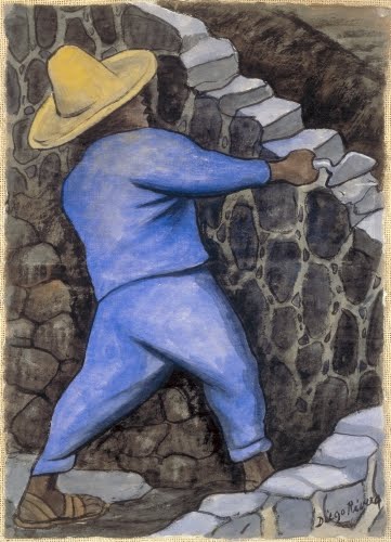 |
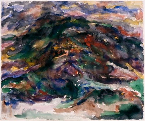
| Diego Rivera (1886–1957, Mexico), Mason, ca.1937. Watercolor on paper, 15" x 11" (38.1 x 27.9 cm). Albright-Knox Art Gallery, Buffalo, NY. © 2016 Banco di Mexico Diego Rivera Frida Kahlo Museum Trust / Artists Rights Society (ARS), New York. (AK-281riars) |
Rivera was undoubtedly one of the most influential artists of the 1900s in the Western Hemisphere. His art work influenced both the development of Mexican modernism, the mural art of the WPA during the Depression (1929–1940), and the Mural Movement in American urban areas in the late 1960s and early 1970s. But, he was no only a muralist. He was also gifted in pastels, charcoal, and watercolor.
Despite going through a Cubism phase while living in Paris (1911–1921), when he returned to Mexico, he was determined to develop a personal style that reflected Mexico’s culture. He was particularly affected by indigenous Mexican peoples, and the art of ancient Mexican cultures had a great impact on the formation of his mature style that emerged in the late 1920s.
Rivera did several watercolor studies of Mexican Indian stone masons. The artist did countless works documenting the humblest jobs in Mexican society among the poorest classes. Like his murals, Rivera's art strove to give dignity to the people whom he believed were the unsung heroes of Mexican culture. Masons, who work on the foundation of buildings, were analogous in Rivera's mind to the soldiers of the revolution who established the foundations of a more equitable society in Mexico.
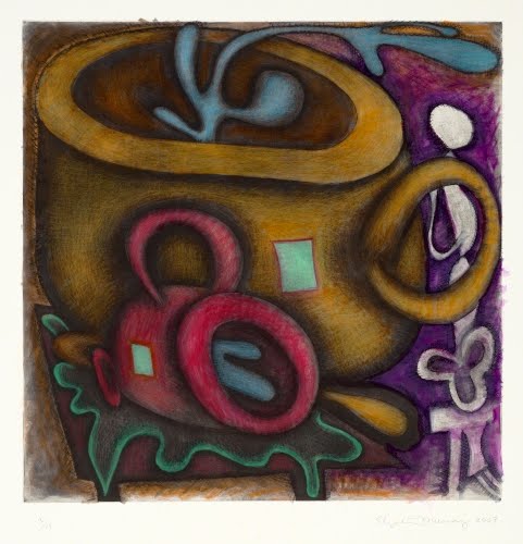 |
| Elizabeth Murray (1940–2007, US), Untitled, 2003. Mezzotint with watercolor additions, sheet: 27 9/16" x 24 9/16" (70.1 x 62.5 cm). The Museum of Modern Art, New York. © 2016 Estate of Elizabeth Murray / Artists Rights Society (ARS), New York. (MOMA-P0298murars) |
One does not really hear the term “mixed-media” used before the 1900s. After the Dada, Surrealist, and Cubist movements, with the introduction of found objects, collage, and other stuff to painting and sculpture, it sort of made sense to coin the term. Watercolor became one of the media that became part of mixed-media works. Ironically, it is often used the same way it was first used in the Renaissance, as an embellishment to printmaking.
The work of painter Elizabeth Murray progressed from a Minimalist sensibility combined with recognizable forms (the influence of Pop Art) through pieced canvases that represented abstracted shapes. The overriding interest in her work was the unity of idea with form. This she usually achieved through color.
Murray began exploring printmaking in the late 1980s. Color lithography and intaglio processes were among the most frequently used. Murray’s prints reflected the same repertoire of images as seen in her painting. The coffee cup (usually with spillage) is among the most recognizable of those forms. Prints such as this present Murray’s joy in the exploration of color used to unify a composition.
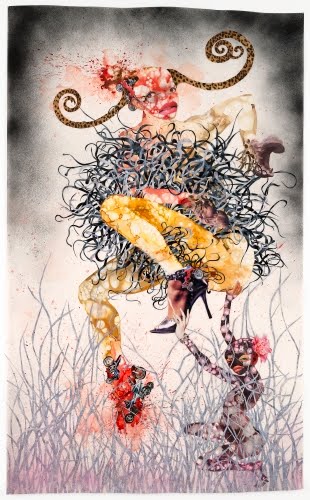 |
| Wangechi Mutu (born 1972, Kenya), One Hundred Lavish Months of Bushwhack, 2004. Collage of cut-and-pasted paper with watercolor, synthetic polymer paint, and pressure-sensitive stickers on transparent paper, 68 1/2" x 42" (174 x 106.7 cm). The Museum of Modern Art, New York. © 2016 Wangechi Mutu. (MOMA-P1888) |
Wangechi Mutu’s work is a powerful representative of the current flourishing of contemporary art in Africa. Her works embody the angst, the damage, and the residual uncertainty left in post-colonial Africa. Her body of work seems biographical, although in a sense she is summing up the state of women in modern Africa. She has termed women’s body’s as “barometers” of current events. Her work references colonial history, current African politics, and the international fashion industry.
Mutu works with cuts outs from magazines, found materials, and everything from fur to glitter. I’m guessing the watercolor was used in the nuanced colors in the corners and at the bottom. Her imagery, while concerned with issues of race, identity, gender, and consumerism, convey both a morbid and a celebratory impulse. This injured woman, seemingly dressed for a festival, is a potent combination of feminist, modern Western and African awareness, creating a type of modern mythology.
Mutu was born in Nairobi, Kenya, and studied at Cooper Union in New York (BFA) and Yale University (MFA). She studied sculpture and anthropology. She lives and works now in Brooklyn.
 |
| Philip Pearlstein (born 1924, US), View of Assisi #5. Watercolor on paper, 25 1/2" x 19 1/4" (64.9 x 48.9 cm). Butler Institute of American Art, Youngstown, OH. © 2016 Philip Pearlstein. (BIAA-180pp) |
Here’s one beautiful work I could not resist putting in. If you don’t recognize the artist immediately, that’s understandable. Pearlstein is more renowned for his photo-realistic nude models. This piece dates from the period when he was under the sway of Abstract Expressionism. He had just won a Fulbright Scholarship and was touring Italy. His love of landscape is evident.
Correlations to Davis programs: Explorations in Art Grade 1: 1.9, 2.7, 2.8, 4.20; Explorations in Art Grade 2: 1.2, 2.8; Explorations in Art Grade 3: 1.1, 1.2, 1.3, 1.4, 5.26, 5.27-28 studio, 5.connections; Explorations in Art Grade 4: 1.2, 1.4, 2.7; Explorations in Art Grade 5: 1.2, 1.6, 4.20, 4.connections; Explorations in Art Grade 6: 1.1, 1.2, 1.3, 4.23-24 studio; A Personal Journey: 3.1, 3.4; A Community Connection: 1.2, 3.4, 4.5; Discovering Drawing: 6; Communicating Through Graphic Design: 5; Experience Painting: 1, 2, 4; The Visual Experience: 9.2, 9.3, 13.5, 14.2, 14.3, 16.3, 16.6; Discovering Art History: 4.4, 4.7, 13.1
Comments