What Type of Balance? You Decide.
I probably shouldn’t be using the word Balance after the latest election. Let’s ignore that by doing some visual exercises. I’m always intrigued with the issue of “balance” in a work of art (one of the Principles of Design, as you know).
Everyone has seen a work of art that isn’t the same on one side as it is on the other (asymmetrical balance), but somehow it seems balanced at first glance. The following, except for the first one, are up to you to decide which of the types of balance they are! I’ll give my vote and you decide if I’m wrong.
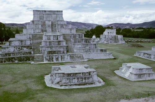 |
| Ancient Guatemala, Zaculeu, Structure I, 200s–900s CE. Image © 2016 Davis Art Images. (8S-22037) |
I understand that the tenets of ancient Greek architecture established the “classical canon” of balance, symmetry, and calm, blah blah blah, but I don’t understand why art history books couldn’t use other examples out there in the world to demonstrate symmetrical balance? After all, what is more “classic” than the classic Mayan period (big circa 250 to 900s CE) in central America?
Zaculeu, about 3.21 kilometers (2 miles) from Huehuetenango in the Guatemala highlands was not as remarkable in architecture and artifacts as the Lowland Mayan cities such as Kaminaljuyú. However, it was the capital for the Mam Maya people (who still inhabit the area), and endured the longest against the Spanish invasion under Pedro de Alvarado (1485–1541) until 1525!
Structure I dominated the Main Plaza in Zaculeu, and is the largest (restored) structure in the city. It is a classical Mayan pyramidal structure with eight superimpositions interrupted by a central ceremonial stairway. It is a splendid example of symmetrical balance. And no, I don’t believe that the ancient Egyptians sailed to Central America in papyrus boats to teach the indigenous people how to build pyramids!
My vote: SYMMETRICAL BALANCE
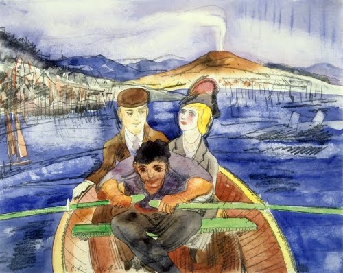 |
| Charles Demuth (1883–1935, US), Boat Ride from Sorrento, illustration for the book Beast in the Jungle by Henry James, 1919. Watercolor and graphite on paper, 8" x 10" (20.3 x 25.4 cm). © Philadelphia Museum of Art. (PMA-2189) |
I totally love the watercolors of Demuth, especially his views of Provincetown, and these sort of mystic illustrations he did for the angst-ridden books of Henry James. Initially trained at the Pennsylvania Academy of Fine Arts, Demuth had already abandoned his academic training to concentrate on watercolors and gouache before World War I (1914–1918). These were coming into their own as stand-alone media, embraced by artists who experimented with modernism because of their easy fluidity. Demuth ultimately became a master of water-based media on a par with Winslow Homer (1836–1910) and John Singer Sargent (1856–1925).
Demuth's mature style was informed by Cubism he had seen at the 1913 Armory Show of European modernism, and from his group of friends in New York that included Marcel Duchamp (1887–1968), the pioneer Dadaist and Surrealist, and Marsden Hartley (1877–1943), an American modernist who had dabbled in non-objective abstraction after stays in Germany and Paris. Demuth’s filmy watercolor layers in this work approximate the fragmentation of form of Cubism, while conveying the story of the book.
At first look this may seem to be symmetrically balanced, but closer inspection shows many digressions. The woman’s hat makes her figure taller. The volcano on the right is lower than the town on the left. But, there’s a nice pyramid between the two visitors and the oarsman with his oars.
My vote: APPROXIMATE SYMMETRY
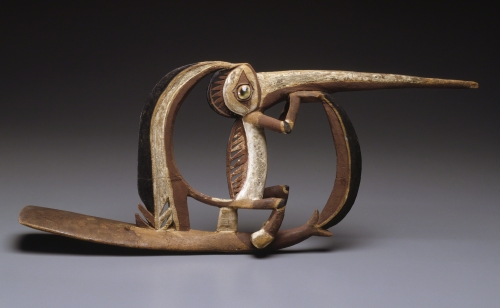 |
| Papua New Guinea, Dance ornament, 1800s. Wood, turbo petholatus opercula (shell), pigment, 7 1/2" x 19" x 2 1/2" (19.1 x 48.3 x 6.4 cm). © Brooklyn Museum. (BMA-1613) |
New Guinea, divided between Irin New Guinea (part of Indonesia) and Papua New Guinea, is the location of the greatest number of dissimilar cultures in Melanesia. It is also the island of the most varied artistic production in Oceanic art. Papua New Guinea is a very prolific region of artistic expression, especially along the Sepik River, located in the northeast of the Asmat region.
Sculpture, painting, or carving adorns almost every object of secular and ritual life. By decorating each object in everyday life with art, it has been traditionally believed to bring the world of the spirits into active participation with the world of humans.
This ornament is tricky. A first squint would seem like symmetrical balance, just like with the Demuth. Closer inspection however reveals differently. It depicts a bird/animal seated on the fin of an elegantly arced fish. The arc of the plume balances the arc of the fish differently, as does the beak of the creature with the head of the fish.
My vote: APPROXIMATE SYMMETRY
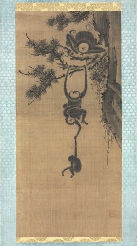 |
| Seo Taek (active 1700s to early 1800s, Korea), Gibbon Family in Pine Tree. Ink on silk mounted as hanging scroll, 33 1/8" x 15 3/4" (84.1 x 40 cm). © Philadelphia Museum of Art. (PMA-6884) |
The earliest historical record of developed painting in Korea is found on painted baskets from the first 100 years BCE. A more substantial record of ancient Korean painting remains on the painted walls and ceilings of tombs from the Three Kingdoms Period (57 BCE–668 CE). Those paintings reflect Buddhist beliefs. During the Joseon period, Confucian beliefs rivaled Buddhism in popularity, with an emphasis on scholarship and the artist/scholar idea always part of Chinese art.
By the 1700s, peace in China and Japanese isolation brought somewhat better conditions to Korea. Subtle elements of indigenous stylistic variations reflect a greater degree of independence in Korea.
Little to nothing is known of this Joseon painter, but the artist left us with a charming painting. The arrangement of the monkeys leads the eye dead center, but it does not take away from the beautiful contrast of positive and negative space. However, there are many elements in the tree and monkeys that the negative space does not symmetrically balance.
So, my vote is: ASYMMETRICAL BALANCE
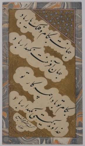 |
| Muhammad Rafi (active 1600s, Iran), Page of natsiliq calligraphy from a dispersed album. Ink, colors and gold leaf on paper, 7 7/8" x 4 3/8" (20 x 11.2 cm). © Brooklyn Museum. (BMA-565) |
The first flourishing of Islamic civilization occurred between the 600s CE and 1600s, a period that saw the collapse of the Roman and Byzantine Empires (ca. 450 CE and 1453, respectively), and the rise of western European nation-states. By the 900s, many regional Muslim powers had developed their own distinct artistic traditions. Islamic artistic traditions differ from those in the West.
Art forms often considered “decorative” in the West—book illustration, glass, metal and textiles—are the major forms of Islamic art. Writing is particularly venerated as it is the means of revealing God’s word. Its primacy as a decorative motif—calligraphy—in architecture is carried into all art forms.
The Safavid period (1502–1736) in Iran is considered the period of renaissance in all art forms, including calligraphy. Nastaliq developed in Iran in the 1300s and 1400s. It is the most fluid and expressive of the scripts. Nastaliq has very short verticals without any "serifs," and deep curved horizontals. It slants to the right in contrast to all the other styles which slant to the left.
The text reads: "May the world be as you desire, the heavens your aid. May the Creator of the world be your protector. May all that you do be according to your wish May the Lord of the World be your guardian. The poor Muhammad Rafi' wrote this, mercy be upon him." Nothing is known about Muhammad Rafi’.
Because the upper right and lower left corners sort of balance each other, my vote for this page of calligraphy is: APPROXIMATE SYMMETRY.
I guess APPROXIMATE SYMMETRY wins the day for me. As I said before, you decide for yourself!
Correlations to Davis programs: Explorations in Art Grade 2: 4.19; Explorations in Art Grade 3: 17-18 studio; Explorations in Art Grade 5: 4.Connections, 5.26, 6.36; A Personal Journey: 4.2; Exploring Visual Design: 7; The Visual Experience: 8.7, 13.6, 14.2; Discovering Art History: 4.6, 4.7, 4.9
Comments