
A True "Renaissance" Person: Herbert Bayer
I was recently reading about Herbert Bayer and realized what a treasure this artist has been! I always appreciated his Bauhaus years and his contributions to graphic design, but, I had really never investigated very deeply how broad his vision was for the Bauhaus aesthetic.
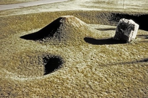 |
| Herbert Bayer (1900–1985, United States, born Austria), Grass (Earth) Mound, from Aspen Meadows, Colorado, 1955. Photo courtesy of the late Artist. © 2016 Artists Rights Society (ARS), New York. (8S-834byars) |
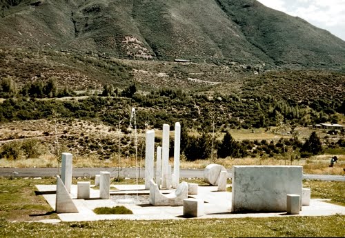 |
| Herbert Bayer, Marble Garden, from Aspen Meadows, Colorado, 1955. Photo courtesy of the late Artist. © 2016 Artists Rights Society (ARS), New York. (8S-833byars) |
By 1946, Bayer was an internationally recognized leader in graphic design as well as interior design. He was approached by Walter and Elizabeth Paepcke, who had a vision to make Aspen, CO into a world-class community that integrated art and culture. From childhood on, Bayer was a lover of nature. That was reinforced in 1923 when he made an extended trip to Italy, sketching and painting what he saw in nature. His initial instinct after World War II (1939–1945) was to return to Austria and build a ski hotel in the mountains.
His visit to Aspen, with its gorgeous mountain views, convinced him to accept the Paepcke’s offer to design an integrated cultural center—the Aspen Institute of Humanistic Studies, today the Aspen Art Institute—into the surrounding environment. Once he moved there he was provided with a lot of design work, which included architecture, outdoor sculpture, and these two groundbreaking earth works. The stylistic designation Earth Works is usually reserved in art history books for works from the 1960s and 1970s. I feel we should extend that designation back to 1955 when Bayer designed Grass Mound and Marble Garden.
I feel that the style Earth Works does not take into account, either, Japanese garden architecture dating back to the 1500s, but that’s another arthiSTORY. Bayer’s works were truly novel for the period in which he created them. They totally put me in mind of ancient Roman ruins, which, considering his long trip to Italy in 1923, may not be a stretch. Isamu Noguchi (1904–1988) created a sculpture garden at MOMA in 1953, but it certainly does not have the same interaction with nature as Bayer’s Marble Garden.
More aspects of this Renaissance Person:
 |
| Herbert Bayer, Bauhaus Books—Kandinsky, Point and Line to Plane, book cover, 1925. Letterpress on paper. Photo courtesy of the late Artist. © 2016 Artists Rights Society (ARS), New York. (8S-802byars) |
Were you aware that Bayer introduced the Universal font in 1925? After graduating from Bauhaus in Dessau having studied graphic design and typography, Bayer started teaching courses in graphic design starting in 1925. He left Bauhaus in 1928 to establish his own design firm which became amazingly successful. While at Bauhaus he designed book covers for Bauhaus publications, and also designed stationery, programs, and flyers. The reduction of forms to utter simplicity at Bauhaus really reflects the influence of Russian Constructivism, don’t you think?
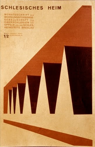 |
| Herbert Bayer, Silesian Home magazine cover, 1927. Letterpress and offset lithograph on paper, 12 3/16" x 8 1/4" (29.8 x 21 cm). Photo courtesy of the late Artist. © 2016 Artists Rights Society (ARS), New York. (8S-809byars) |
Bayer is credited with moving graphic design into the modern age with his wonderful magazine, advertisement, and poster designs. This cover is one of my favorites, because it perfectly demonstrates how compatible abstraction, fine art, and architectural structure are. It’s too bad the Nazis considered this “degenerate” art. It’s a lot more exciting than the stale, overblown Neoclassicism that they preferred.
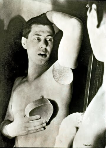 |
| Herbert Bayer, Self-Portrait, 1932. Photomontage, 14 3/16" x 11" (36 x 28 cm). Photo courtesy of the late Artist. © 2016 Artists Rights Society (ARS), New York. (8S-821byars) |
While working in Berlin after 1928, Bayer explored the use of photographic montage in his design work. This had been pioneered by the Surrealists. Bayer used it both professionally, and for his private work. This “self-portrait” has all the hallmarks of Surrealism. Bayer’s reflection in the mirror is not the true physical world, but something out of the subconscious or dream world.
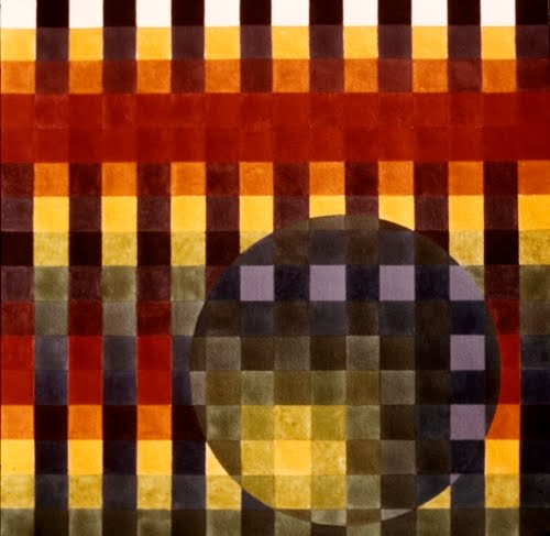 |
| Herbert Bayer, Chromatic Squares with Circle, 1966. Acrylic on paper, 20" x 20" (51 x 51 cm). Photo courtesy of the late Artist. © 2016 Artists Rights Society (ARS), New York. (8S-762byars) |
It seems there were very few avenues of style that Bayer did not explore. From the mid-1960s to the early 1970s much of his painting was concerned with the optical effects of color. This was something he would have studied at Bauhaus with Josef Albers (1888–1976). In the 1960s, the exploration of the optical sensations of movement caused by the juxtaposition of certain colors falls under the Op Art stylistic designation.
Correlations to Davis programs: Explorations in Art 4 6.35; Explorations in Art 5 3.15, 3.16, 5.25-26 studio; Explorations in Art 6 4.24, 5.25; A Community Connection 8.4; A Global Pursuit 8.4, 8.6; Communicating Through Graphic Design 5, 6, 7; The Visual Experience 9.3, 9.5, 9.14, 10.4, 16.6, 16.7; Discovering Art History 14.4, 17.2, 17.5
Comments