The Psychedelic Poster
This fabulous poster advertised a rock show at the Fillmore Auditorium in San Francisco that occurred on this date in 1966. The Fillmore was a “temple” to rock music at the time. It is considered by many art historians to be the place that inspired the development of a new kind of unique, hand-drawn typeface. This typeface was subsequently labeled “psychedelic” because it was not easy to read and it was connected to drug abuse that was supposed to “expand consciousness.” Here are some poster artists who flourished in the psychedelic poster style.
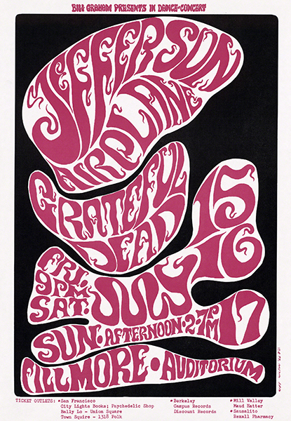 |
| Robert Wesley Wilson (1937–2020, U.S.), Poster for Jefferson Airplane / Grateful Dead, July 15–17, 1966. Color offset lithograph on paper, 20 ½" x 14 ½" (52.1 x 36.8 cm). Courtesy of the Museum of Modern Art, New York. © 2023 Artist or Estate of Artist. (MOMA-P1293) |
The artist Robert Wesley “Wes” Wilson initiated the psychedelic rock poster in 1965 at the Fillmore Auditorium. After immersing himself in the psychedelic scene of the early 1960s, Wilson developed his own distinctive lettering method, ignoring the common wisdom to keep poster designs simple and readable. Wilson’s style became a symbol of the “turned on” graphics style of the hippie era.
After a year of cranking out two posters a week, Wilson retired from the rock poster movement in 1967. His work had established a distinctive genre of poster. The vibrant color and daring lettering represented the energy of the psychedelic rock movement of the time. The thick, flowing font was easily transformed into sculptural forms. In 2005, his signature style appeared once more for the title sign of a retrospective exhibition of psychedelic art, Summer of Love: Art of the Psychedelic Era, at the Tate Liverpool Museum.
Born in Sacramento, Wilson took mechanical and architectural drawing in high school, briefly working in a San Francisco architect’s office. Dropping out of college in San Francisco in 1963, he was determined to pursue a path as an artist. Wilson accepted an offer to help start a printing and design company, Contact Printing, in 1964. He learned poster design on the job.
Aware of the rock music scene developing in San Francisco, by 1965 Wilson produced graphic art works that brought him attention. His work attracted the interest of Chet Helms (1942–2005), manager of the emerging rock band Big Brother and the Holding Company and promoter of the counterculture scene. The handbills that Helms commissioned from Wilson led to designs for flyers for the January 1966 Trips Festival, the event that charted the course of the psychedelic rock dance scene. Thereafter, the Fillmore Auditorium and Avalon Theater began staging regular weekend dance concerts, for which Wilson designed posters.
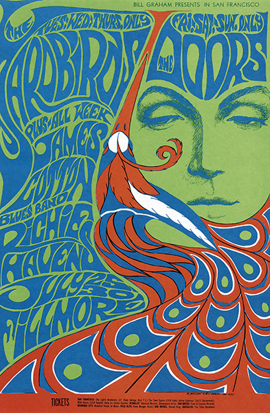 |
| Bonnie MacLean (1949–2020, U.S.), Poster for The Yardbirds, The Doors, James Cotton Blues Band, Richie Havens, July 25–30, 1967. Offset color lithograph on paper, 21 ¼" x 14" (54 x 35.5 cm). Courtesy of the Museum of Modern Art, New York. © 2023 Artist or Estate of Artist. (MOMA-P1273) |
When Bonnie MacLean began creating posters for the Fillmore, she initially adapted the psychedelic format established by Wilson. She gradually included motifs that interested her: Gothic, Art Nouveau, and eventually Native American. The lettering of this poster is a “font” that Wilson developed. True to her past as a figurative artist, MacLean’s designs usually included a female face, typically characterized by a dazed or detached look.
Born in Philadelphia, MacLean grew up in Trenton, New Jersey. She earned a BS in French from Penn State University in 1961, moving to New York immediately after. There she worked at the Pratt Institute, taking drawing classes at night. In 1963, she moved to San Francisco, working in the office at the Fillmore Auditorium, the premier rock venue at the time. When Wilson quit in 1967, MacLean took over as Art Director. She was already painting signboards for the Fillmore in a version of Wilson’s psychedelic style and went on to create more than 30 posters for the venue. Her more nuanced psychedelic style dispensed with Wilson’s preference for Art Nouveau-inspired forms, incorporating gothic elements and showing off her own talent for drawing faces and figures.
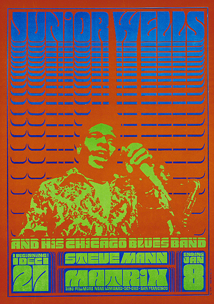 |
| Victor Moscoso (born 1936 U.S., born Spain), Poster for Junior Wells and His Chicago Blues Band, 1966. Color offset lithograph on paper, 19 11/16" x 14 1/8" (50 x 36 cm). Courtesy of the Museum of Modern Art, New York. © 2023 Victor Moscoso. (MOMA-D0102) |
Victor Moscoso’s trademark use of vibrating colors was influenced by the Homage to the Square series by Josef Albers (1888–1976), one of his teachers at Yale University. His psychedelic posters for “hippie” dance halls in San Francisco in 1967 were influential in the psychedelic rock poster movement. Moscoso was the first artist to use photographic collage in many of his posters. The jarring, almost dayglow, colors were meant to appeal to the hippie subculture at the time, which rejected any form of conventional aesthetic. The colors were, in essence, a form of protest against the status quo, particularly in poster art.
Born in Spain, Moscoso studied art at Cooper Union in New York and Yale University. He moved to San Francisco in 1959, attending the San Francisco Art Institute and becoming a faculty member there. He is considered one of the first of the rock poster artists of the 1960s era with formal academic training and experience.
Correlations to Davis programs: Explorations in Art 2E Grade 3: 3.7; Explorations in Art 2E Grade 6: 5.4, 5.6; A Personal Journey 2E: 4.3; Communicating through Graphic Design 2E: p. 12, pp. 123–124, pp. 211–213
Comments