The Expanded Toulouse-Lautrec
Last week I was a jaded art historian. This week I am a socially responsible one. I always feel it is unfortunate when appreciators of art only know one genre of the work of a certain artist. Everyone knows that Henri de Toulouse-Lautrec was one of the pioneers of the “art poster” and did a lot of innovative graphic design. Many are only familiar for his works concerning the night club Le Moulin Rouge. He executed so many design jobs, I think it’s important for you to see a little bit of the breadth of his work.
Post-Impressionism stressed structure above scientific dissection of the visual impact of light on color. However, this interest in structure was combined with the Impressionist concern with documenting fleeting moments of everyday life. This included spontaneous movement and, to a great extent, the influence of Japanese prints that illustrated scenes of everyday life.
Toulouse-Lautrec excelled at drawing from a young age. He was much influenced by Degas's drawing style, which was grounded in his studies in great drawings by Renaissance and Baroque artists. In 1882 he moved to Paris and gravitated toward the Bohemian section of Montmartre because of the liveliness of that section of the city. He initially painted outdoors like the Impressionists, using oil paint thinned to transparency, which he executed inlayers on cardboard. This technique peinture á l'essence, allowed his sketchy brush work to show through.
Starting in the late 1880s, Toulouse-Lautrec began to create posters in the relatively new process of color lithography for some of the more popular nightspots in Montmartre. His lithography eventually was primarily inhabited by his studies of personages from the neighborhood, illustrations for theater programs, magazines, and novels. His technique was greatly influenced by Japanese prints in the vague, often skewed perspective, open composition, strong contour of shapes, and flat areas of color.
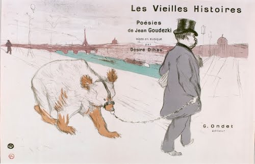 |
| Henri de Toulouse-Lautrec (1864–1901, France), The Old Stories (Les Vielles Histoires), music sheet cover for collection of poems of Jean Goudeszki (1866–1934 France), 1893. Color lithograph on paper, 19 1/2" x 25 1/8" (49.5 x 64 cm). © Albright Knox Art Gallery, Buffalo, NY. (AK-715) |
Toulouse-Lautrec brilliantly used economy of line in his graphic design to emphasize the main point of the piece. His use of asymmetrical balance mirrors that seen in classic woodcut prints of Japanese ukiyo-e. In this music sheet cover—of which several versions both colored and not colored were printed—the musician Désiré Dihau (1833–1909) leads the folkloric poet Goudeszki, caricatured as a bear, across the Pont des Arts in Paris.
Toulouse-Lautrec did music sheet covers for other songs of Dihau: The Old Butterflies (Les Vieux Papillons), Nursemaid (Berceuse), and Buy my Pretty Violets (Achetez mes Belles Violettes). Dihau was a famed bassoonist in Paris, who was immortalized in Edgar Degas’ (1834–1917) early work Orchestra of the Opera (1869, Museé d’Orsay, Paris).
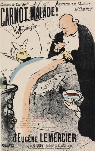 |
| Henri de Toulouse-Lautrec, Sick Carnot (Carnot Malade!), music sheet cover for Songs from the Chat Noir (night club), 1893. Color lithograph on paper, 10 7/8" x 6 15/16" (27.6 x 17.6 cm). © Albright Knox Art Gallery, Buffalo, NY. (AK-2086) |
Because Toulouse-Lautrec spent so much of his time sketching everyday people, he was able to produce hundreds of humorous caricatures of important people quickly for publication. This advertisement is for a humorous monologue about the French Republic’s people’s fear of losing to illness a capable and immensely popular president, Carnot, after decades of political turmoil. Unfortunately, Marie François Sadi Carnot (president 1887–1894) was assassinated in 1894 by a nutty Italian anarchist. That historical fact makes this humorous monologue all the more ironic.
 |
| Henri de Toulouse-Lautrec, A Gentleman and a Lady, theater program cover for the play The Money” (L’Argent), at the Théâtre Libré, 1895. Color lithograph on paper, 12 1/2" x 9 7/16" (31.9 x 24 cm”). © Albright Knox Art Gallery, Buffalo, NY. (AK-1565) |
The diagonal, open composition of this program cover, with its simple masses of color and sparseness of detail, is certainly reminiscent of Japanese ukiyo-e prints. It also shows the penchant of Post-Impressionist artists for reducing subject matter to the most elementary forms. Although it depicts an intimate every-day, casual moment, which was the mainstay of Impressionism, in all other respects it is as far from Impressionism as it can be. The forms in this lithograph remind me a lot of the work of Édouard Vuillard (1868–1940).
The Théâtre Libré was an experimental theater in Paris that operated between 1887 and 1896. It was the first non-commercial theater, and greatly influenced experimental theaters throughout Europe. Among the controversial psycho-realist playwrights whose works appeared there were Ibsen, Tolstoy, and Brieux. I’m not even sure if Toulouse-Lautrec was paid for this work, for the original owner of the theater André Antoine (1858–1943) gave it up as a financial loss in 1894 to another manager.
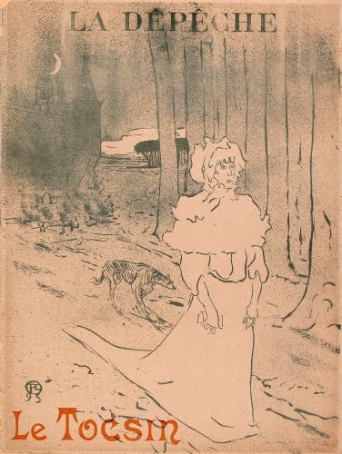 |
| Henri de Toulouse-Lautrec, Advertisement for the gothic novel The Alarm Bell (Le Tocsin), serialized in the publication The Dispatch (La Dépêche), 1895. Color lithograph on paper, 21 3/16" x 15 3/4" (53.7 x 40 cm). © Albright-Knox Art Gallery, Buffalo, NY. (AK-582) |
There’s nothing more Goth than some of Toulouse-Lautrec’s scarecrow-like figures. It’s particularly effective for an ad for a gothic novel. This advertisement was commissioned by Arthur Huc, editor of Toulouse’s (Toulouse-Lautrec’s home region) most influential newspaper La Dépêche de Toulouse, and a significant patron of the artist since 1891. On this print, also sometimes called The Keeper of the Castle (Chatelaine), Toulouse-Lautrec used the crachis (spatter) technique in which he created a mist of pigment that simulates airbrush by causing the brush to splatter. He first used that technique in his first poster, the famous Moulin Rouge Concert Bal tous les Soirs (1891).
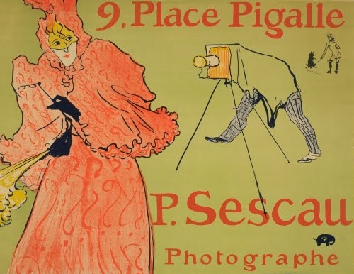 |
| Henri de Toulouse-Lautrec, Poster advertising P. Sescau, Photographer, 1896. Color lithograph on paper, 23 5/8" x 28 3/8" (60 x 72 cm). © The Museum of Modern Art, New York. (MOMA-D0757) |
Toulouse-Lautrec also designed ads for businesses other than night clubs. This is the only known advertisement he did for the up-and-coming medium of photography. Ironically, in much of advertising in the 1900s, photography replaced lithography. Sescau took many portraits of Toulouse-Lautrec, including one whacky one where the painter was dressed as a Japanese nobleman complete with fan. Sescau popularized an early form of film called ciné roman, in which still photographs were accompanied by voice and music.
Toulouse-Lautrec also portrayed the photographer.
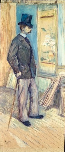 |
| Henri de Toulouse-Lautrec, Portrait of Mr Paul Sescau, 1891. Oil and gouache on cardboard, 32 3/4" x 14 1/4" (83.2 x 36.2 cm ). © Brooklyn Museum. (BMA-4885) |
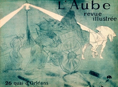 |
| Henri de Toulouse-Lautrec, Poster advertising The Dawn Illustrated Revue, 1896. Color lithograph on paper, 23 13/16" x 31 11/16" (60.5 x 80.5 cm). © The Museum of Modern Art, New York. (MOMA-D0756) |
L’Aube was an illustrated art review journal. Toulouse-Lautrec once again used the crachis technique to heighten the effect of early darkness in this poster. Although most of the denizens of the artist’s prints were considered the “underclass” (actors, prostitutes, dancers, artists, and the like), he rarely, if ever, showed the really poor people of Paris. The figures of these poor people attending a garbage cart remind me of the slope-shouldered poor in the prints of Daumier, or the paintings of Millet.
Correlations to Davis programs: Explorations in Art Grade 3: 3.17; Explorations in Art Grade 6: 5.27, 5.27-28 studio; A Personal Journey: 4.2, 4.3; A Community Connection: 1.2, 8.2; A Global Pursuit: 7.4; Communicating Through Graphic Design: 3, 6; Exploring Printmaking: 6; The Visual Experience: 9.4, 12.3, 12.7, 16.4; Discovering Art History: 13.2.
Comments