It's Summer
It seems that every year it takes longer and longer for summer to get here. Then when it does get here, it’s gone in a flash! I can’t think of anything bad to say about summer, well, except when it’s so hot that the spotlight on my easel makes it too hot for me to paint. Speaking of art, here are some artworks with summer themes you may never have seen.
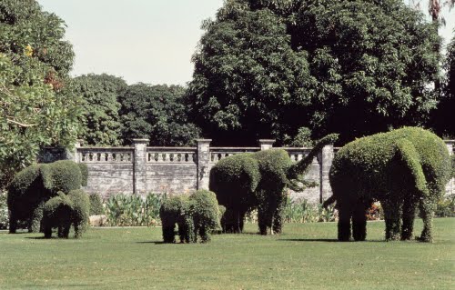 |
| Thailand, Bang Pa-In Summer Palace, Bangkok, elephant topiary in gardens, 1872–1881. Image © Davis Art Images. (8S-10355) |
Can you just feel the warmth of the sun illuminating the tops of these “elephants”? The Bang Pa-In was a summer palace for Thai kings built in the 1600s before Bangkok was the capital. It was rebuilt by King Rama V (1853–1910) to celebrate the 100th anniversary of the Chakri Dynasty.
The gardens were designed with moats and plantings influenced primarily by Versailles (by European landscape architects) because Rama V wanted to give his monarchy a Western image. However members of his court prevailed upon him to request some traditional Thai elements. The topiary elephants were one concession. Ironically, Thailand's empire in Southeast Asia (which included Cambodia, Laos and, parts of Indonesia) was severely reduced by European occupation (mostly British and French) by 1909.
European topiary dates from ancient Roman times. Topiary is the practice of training and clipping perennial plants to form shapes, either geometric or organic shapes, such as elephants. Japanese and Chinese topiary, on the other hand, was intended to represent natural elements such as clouds, mountains, or waves. The topiary garden at Bang Pa-in was carried out during a period of revival of architecture and landscape decoration in 1800s Europe influenced by Baroque (particularly Dutch) gardens, when topiary landscape architecture was particularly fashionable.
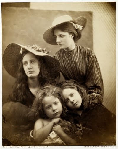 |
| Julia Margaret Cameron (1815–1879, Britain), Summer Days, 1866. Albumen print on paper, 13 7/8" x 11 1/8" (35.3 x 28.2 cm). © National Gallery of Art, Washington. (NGA-P1068) |
I’m not sure if the mopey faces on these models is just the way the British react to hot weather in summer, or if it’s because they had to sit through a long exposure (45 to 60 seconds). In any case, the languid poses are a perfect example of the “Art Photography” that was a popular pursuit within the genre during the 1800s.
In the mid-1800s, unlike painting and sculpture, photography did not require training in the academies, long apprenticeships, or lengthy practice. For these reasons, women were encouraged by photographic journals to use the medium. They would not need to be exposed to nude models in the academies, and they practice the art form from home, still considered the most "appropriate" place for women. In England, amateur photographers like Cameron believed that photography as art should deal with suitable and uplifting themes.
Cameron, born in Ceylon to a British official and educated in Britain, received her first camera in 1864 as a gift. She immediately began to pursue photography earnestly, selling her prints in London. In late 1865, she began using a larger camera that held a 15" x 12" glass negative, rather than the 12" x 10" negative of her first camera. The larger camera helped her create more compelling, up close compositions. She was well-versed in effectively posing her models, mostly neighbors and friends.
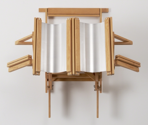 |
| Ronald Bladen (1918-1988 US, born Canada), Double Summer, 1987. Aluminum and wood, 46 1/8" x 53 3/4" x 27 1/4" (117.1 x 136.5 x 69.2 cm). The Museum of Modern Art, New York. © 2016 Estate of Ronald Bladen / Licensed by VAGA, New York. (MOMA-S0595blvg) |
In the work of Ron Bladen, I’m accustomed to seeing his huge, Primary Structures that take up whole plazas or gallery spaces. This piece is much more intimate, though. It follows his tendencies toward minimalism. In my mind it is titled Double Summer because it looks like two lawn chairs folded up on the beach. It’s either that or two of those folding reflectors with a mirrored surface people used to hold to get tan under their chin, in a handy frame? I’m pretty sure my musings are wrong, because it was titled by Bladen and his assistant Larry Deyab while they worked on it during the hot summer of 1987.
Bladen was born in Vancouver, BC to a British steelworker and landscape architect. He himself worked as a ship’s welder during World War II (1939–1945). This job helped him build his monumental Primary Structure pieces of the 1960s, such as his famous The X (1965). He studied both painting and sculpture at the San Francisco Art Institute. During the 1950s he produced gorgeous, non-objective paintings much in the action painting spirit of Abstract Expressionism.
By the early 1960s he was inclined toward the Minimalism phenomenon, which was a direct reaction against Abstract Expressionism’s emphasis on process. His gallery-size standing pieces of the 1960s became large wall installations during the 1980s, often with the addition of polished aluminum.
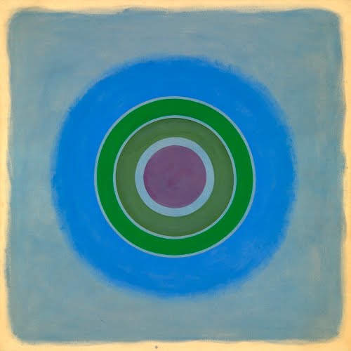 |
| Kenneth Noland (1924–2010, US), Sounds in a Summer Night, 1962. Acrylic on canvas, 69 11/16" x 70" (177 x 178 cm). The Museum of Modern Art, New York. © 2016 Kenneth Noland / Licensed by VAGA, New York. (MOMA-P2175novg) |
I completely understand Noland’s choice of colors in this painting. It so reminds me of lying in bed on a summer night with a partial moon bathing everything in a bluish white light. I’m not certain but I think this piece is on unprimed canvas.
Born in the art colony town of Asheville, North Carolina, Noland studied at nearby Black Mountain College (1946–1948), working with Minimalist Ilya Bolotowsky (1907–1981) and geometric Color Field artist Josef Albers (1888–1976). After a year in Paris in 1948, he returned to the US, moving to Washington DC in 1949. His paintings at the time reflected the all-over painting abstractions of l'Art Informel, the European counterpart to Abstract Expressionism.
Noland met Helen Frankenthaler (1928–2011) and briefly experimented with staining entire, raw canvases. In Washington he encountered a group of painters known as the Washington Color School Painters, among them Morris Louis (1912–1962), who, like Frankenthaler, stained raw canvas with pure color.
Noland's first completely unique statements of Color Field lasted from the mid-1950s to about 1962, after he had discovered the center of the canvas as a focal point for his compositions. Ensuing were paintings where the principal image from concentric circles exactly centered on the square canvas.
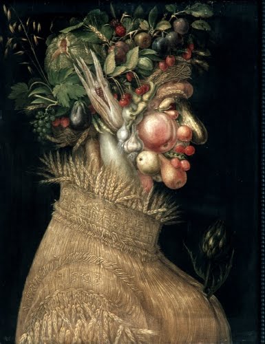 |
| Giuseppe Arcimboldo (ca. 1527–1593, Italy), Summer, 1563. Oil on lindenwood, 26 3/8" x 20" (67 x 50.8 cm). Kunsthistorisches Museum, Vienna, Austria. Photo © 2016 Dr Ronald Wiedenhoeft / Saskia, Ltd. (Lif-0004) |
Every so often, when I look at Arcimboldo’s composite figures, they seem creepy to me, especially the lips. But, this bust of summer does present all the traditional (at the time) attributes of the season, primarily harvested foodstuffs. I guess a contemporary composite image of summer would consist of tubes of sunblock and UV-blocking sunglasses?
Arcimboldo, the son of a painter named Biagio, was born in Milan. His family was well connected with the nobility and church, and Arcimboldo had no trouble securing commissions for frescoes and stained glass in Milan Cathedral. His conventional portraits and religious subjects were apparently accomplished enough to secure him a job as court painter (1562) to the Holy Roman Hapsburg Emperors Ferdinand I (1503–1564) and Maximilian II (1527–1576) for whom he painted conventional portraits.
The Hapsburg court in Vienna was full of Renaissance scientists, philosophers, and eccentrics. It was in this milieu that Arcimboldo executed his series of figures composed of various organic and man-made objects about the Elements and the Seasons, of which this is part. These paintings were presented to Maximilian in 1569. Cleverly composing a figure of fruits, vegetables, and grains fit right in with the Renaissance fascination with witty puzzles, double entendre, and visual games.
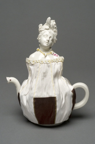 |
| Hella Jongerius (designer, born 1963, Netherlands) and Nymphenburg Porcelain Factory (1747–present, Nymphenburg, Germany), “Summer” teapot from the Four Seasons set, 2007. Hand painted porcelain, 10 1/2” x 6" (26.7 x 15.2 cm). Philadelphia Museum of Art. © 2016 Hella Jongerius. (PMA-6404) |
Wrapping up this ode to summer is an artwork from another series dedicated to the Four Seasons, but decidedly less creepy than Arcimboldo…maybe. I’m not a big fan of anything Rococo, but, I think it’s awesome that you see a revival of the style in the 21st century, such an anachronism. Jongerius took the traditional approach of personification for her Four Seasons set: women for summer (teapot) and spring (hand mirror) and men for autumn (wine jug) and winter (candleholder). I like her work, particularly in porcelain, because she does a lot of the work by hand.
Jongerius is a Dutch industrial designer who works in Berlin. She graduated from the Design Academy Eindhoven in the Netherlands. In the true spirit of Bauhaus, Jongerius has always emphasized fusing industry with art, high and low technology, and traditional imagery produced by industrial process infused with hand work. She works for other iconic brands such as Vitra and IKEA.
Europeans went nuts over porcelain when it was first imported during the 1500s. The secret to porcelain manufacturing (kaolin) was not discovered until the 1700s by a German chemist. Nymphenburg was one of the manufactories established (1747) to provide an alternative to expensive imported Chinese porcelain. Nymphenburg is perhaps most renowned for the porcelain figurines they produced of commedia dell’arte characters.
Correlations to Davis programs: Explorations in Art Grade 3: 4.24, 6.35, 6.studio 35-36; Explorations in Art Grade 5: 3.14; Explorations in Art Grade 6: 4.24, 4.studio 21-22, 4.studio 23-24, 5.25; A Personal Journey: 3.1, 3.4, 7.4; A Community Connection: 7.2, 7.4, 8.4; A Global Pursuit: 4.4, 9.4; Focus on Photography: 2, 3, 5; Experience Clay: 3, 4; ; Exploring Painting: 12; Exploring Visual Design: 7, 9, 12; The Visual Experience: 9.3, 9.5, 10.4, 10.6, 10.14, 13.3, 15.9 16.4, 16.7, 16.8; Discovering Art History: 2.2, 4.5, 4.activity 1, 9.2, 12.4, 17.3
Comments