Letters Are Beautiful
I learned long ago how venerated calligraphy is in some cultures, and we speak of that in many of our Davis books. A short while ago as I was reading about contemporary Iranian artist Parastou Forouhar, whose art form is whole gallery rooms covered in Kufic calligraphy, I began to ponder (as art historians will) how we Westerners perceive writing.
It’s unfortunate that many no longer know how to write cursively, but what do we say when we see the writing of somebody who still does? Do we say/think “Oh what beautiful art!” or “Oh, you have beautiful handwriting!”? At first I was, like, well, in the West, most people view handwriting as they would a chair or plate, as a utilitarian form of expression.
As I looked through our images, however, I realized that throughout history there have always been examples of fine art that also happen to be legible writing. Ah ha moment. If we currently consider furniture and ceramics fine art, then I’m proposing to do the same with handwriting. You decide!
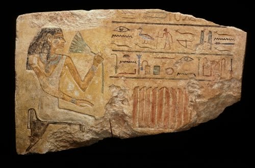 |
| Ancient Egypt, relief of Lady Wadjkaues, 1971–1926 BCE, from Tomb 3 at Deir el-Bersha. Painted limestone, 14 1/2" x 23 1/4" x 1 3/4" (37 x 59 x 4.5 cm). © Museum of Fine Arts, Boston. (MFAB-707) |
There is such a beautiful elegance to ancient Egyptian hieroglyphics. They are basically pictographs that were codified into a written language around the same time (ca. 3000 BCE) that Egyptians established the formulas for depicting the human figure and objects. Since hieroglyphics were closely related to the Egyptian religion and funerary ritual, hieroglyphics and art were connected intimately, as well. Many of the symbols used in hieroglyphics actually represent the word for what they depict, and were taken from the codified forms seen in reliefs and paintings. This relief defines Wadjkaues as the mother of Sep, the scribe of royal monuments, and the wife of Amenemhat, the “governor” of the Upper Egypt Hare Nome (province).
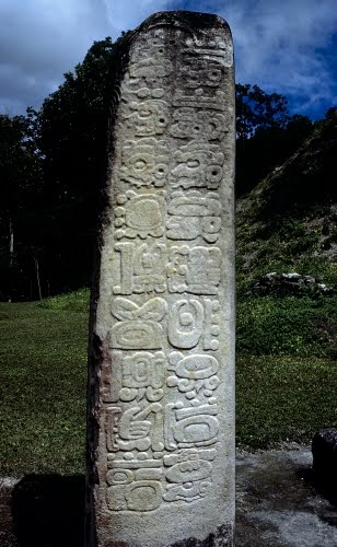 |
| Ancient Guatemala, Mayan, Stele 3 from the Great Plaza, Tikal, ca. 600–900 CE. Image © 2016 Davis Art Images. (8S-21030) |
Tikal was the second largest city of the Classic Period (ca. 600–900 CE) in central Americas. European “scholars” have dubbed the Mayan glyph writing system “hieroglyphics” because all they could think of to compare it to was the ancient Egyptian writing system. Most of the monuments and stelae on the Great Plaza date from the 700s CE. The stelae on the plaza represent rulers on one side with glyphs on the other. The Mayan glyph system can be traced back to extant examples from the 200s BCE. The glyphs are read in columns two glyphs wide from top to bottom then back to the top of the next column. The stela sculpture of Tikal was intricately painted. The earliest known dynastic monument stele displaying Tikal's emblem glyph dates from 279 CE.
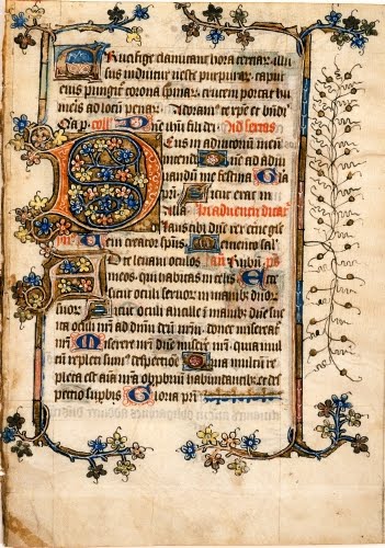 |
| Britain, Page with a decorated initial D from the Book of Hours of Salisbury Cathedral, ca. 1390. Ink and tempera on paper, 7 11/16" x 5 7/8" (19.5 x 14.9 cm). © Albright-Knox Art Gallery, Buffalo, NY. (AK-1915) |
From the collapse of the western Roman Empire in Western Europe during the 500s CE until the late 1300s, manuscript illustration and decoration (i.e. illumination) was the primary form of painting. In the early Middle Ages (ca. 500s to 1000s), most books were copied in monasteries or convents exclusively for religious use. When secular people started patronizing copies of sacred books, they demanded more lavish editions, including pictures. This moved book copying from the religious to the lay realm. The establishment of guilds for artists between the 1100s and mid-1200s effectively eliminated the need for priestly copyists. Professional calligraphers copied the books, so there is a wide variety of styles in the way they copied the Latin. The book of hours was an exclusive domain of the wealthy, a book of prayers to be said throughout the day. Lavishly decorated initial letters such as this mark the beginning of a prayer or gospel. Ironically, another “wow” development—moveable type—in the 1450s spelled the death knell for the genre of lavishly painted (and expensive) illuminated manuscripts.
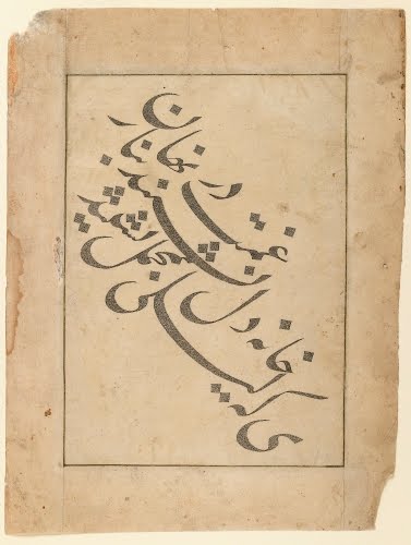 |
| Iran, Title page from a copy of the Shahnama (“Book of Kings”), 1536. Ink on paper, 15 7/8" x 9 13/16" (40.3 x 25 cm). © Brooklyn Museum. (BMA-2893) |
Paper was introduced to Islamic lands during the mid- to late 700s CE by the Chinese. This made the copying of books a lot easier than using animal skin, and cheaper. It also opened up the possibility for wider dissemination of books to the general public. Aside from the Qur’an (which was never illustrated with pictures), a variety of books began to be illustrated starting in the 1000s. This included scientific treatises, epic poetry, histories, and scholarly studies. This is a frontispiece from a Book of Kings, the epic poem about Persian rulers from ancient times to the time of Muhammad by the Iranian poet Abul-Qasim Firdawsi (940–1020). Arabic calligraphy is so gorgeous. I can’t tell if this is Thuluth or Towqi’ script, but it sure is elegant.
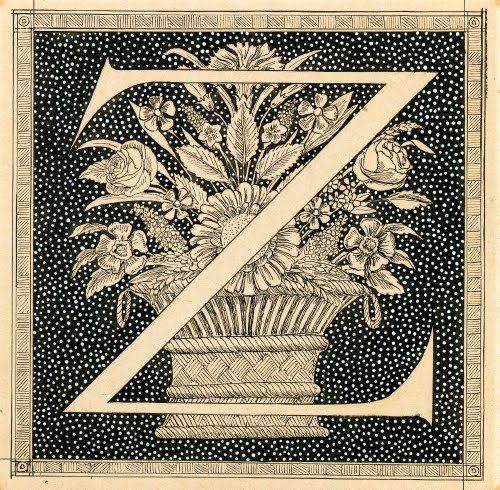 |
| James Tissot(1836–1902, France), Capital Letter Z, from the Appendix to the portfolio The Life of Our Savior Jesus Christ, 1886–1894. Ink on paper mounted on board, 4 11/16" x 4 11/16" (11.8 x 11.9 cm). © Brooklyn Museum. (BMA-2556) |
James Tissot was a society painter of scenes of middle class life during the 1870s and 1880s with little or no connection to Impressionism other than an interest in fashionable urban life. He began producing more religious subjects after he traveled to Egypt and the Middle East. Subsequent to his trip and scads of studies of indigenous costume, architecture, and even flora, he produced a portfolio of 350 watercolors on the Life of Christ. The book, entitled The Life of Our Lord Jesus Christ also for some reason included three pages of decorated letters like this. They’re each lovely, although I didn’t know Tissot was also a graphic artist. This is from page 354 of an appendix called Pen and Ink Drawings, which included hundreds of figure studies from the Middle East.
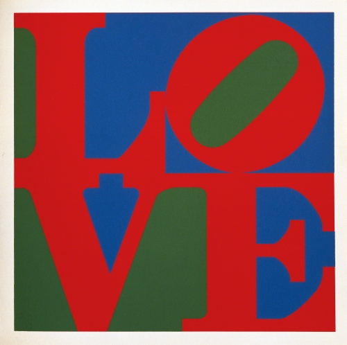 |
| Robert Indiana (born 1928, US), LOVE, 1967. Screenprint on paper, 34" x 34" (86.3 x 86.3 cm). The Museum of Modern Art, New York, © 2016 Robert Indiana / Artists Rights Society (ARS), New York. (MOMA-P3147inars) |
Since Pop Art elevated Campbell’s Soup and comic books to the status of fine art, it’s only fitting that beautiful lettering (in Clarendon Black font) also be accorded the same honor. Everyday lettering was part and parcel of Pop Art. Although Indiana initially was drawn to color field painting of Abstract Expressionism, he was drawn to the early 20th-century movement of Precisionism, which examined aspects of American culture in extreme close-up.
Indiana’s gift to Pop Art came from his main inspirations of traffic signs, commercial signage and stencil lettering. Unlike most of the Pop artists, however, his LOVE works were social commentary, aimed with irony at the hollow usage of the word by the hippies, and as an obvious counter to the Vietnam War (1959–1975).
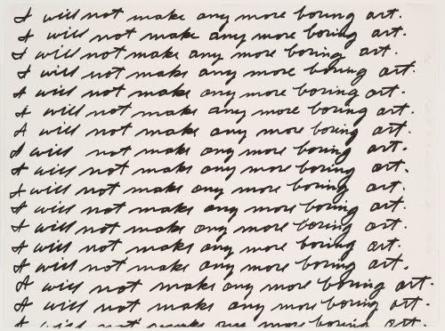 |
| John Baldessari (born 1931, US), I will not make any more boring art., 1971. Lithograph on paper, 22 3/8" x 29 9/16" (56.8 x 75.1 cm). The Museum of Modern Art, New York, © 2016 John Baldessari. (MOMA-P1033) |
If ever writing was elevated to an art form in Western art, it was as part of the Conceptualist movement. It is little wonder that, in a period when the nature of art was under serious reevaluation in the 1960s, that the movement of Conceptualism evolved. It was the logical end result of several movements that questioned the status quo in the art world: Pop Art, New Realism, Performance, and Minimalism.
Conceptualism incorporates Pop's use of language combined with Minimalism's emphasis on process rather than object. Conceptual artists consider the idea to be the work of art. Already in 1967 the Minimalist Sol LeWitt (1928–2007) had expressed the belief that the planning and decisions around an idea were superior to execution of a work. As it was for many Pop artworks, the Dada movement is considered the ancestor of the concept of idea as art. I’m not sure which 1960s movement Baldessari’s statement references.
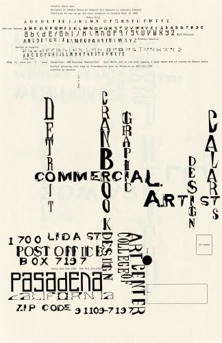 |
| Edward Fella (born 1938, US), Dead End, poster advertising graphic design exhibition at the Pasadena Art Center, 1995. Lithograph on paper, 17" x 11" (43.2 x 28 cm). The Museum of Modern Art, New York, © 2016 Edward Fella. (MOMA-P1207) |
I bet you didn’t know that the first font developed that did not imitate handwriting was Garamond in 1490! That paved the way for the development of hundreds of fonts through the 2000s. Edward Fella is a graphic design artist whose work has also had a major impact on the world of typography. His earliest works for clients were humorous combinations of drawing and lettering. He ultimately designed unique, personal fonts by cutting and pasting parts of various fonts in startling combinations. His unique style developed during the Postmodern and Deconstructivist periods, when traditional perceptions of design and beauty were under reevaluation. Ironically, what started out as unique works of art in his hand-drawn type and inkblot icons are now part of Emigré® font sets.
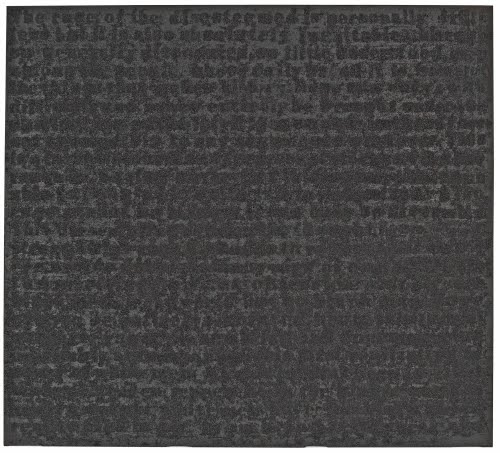 |
| Glenn Ligon (born 1960, US), Untitled (Rage) #2, 2002. Mixed-media on canvas, 74 7/8" x 82 5/8" (190.2 x 209.9 cm). Albright-Knox Art Gallery, Buffalo, NY. (AK-141) |
The work of African American artist Glenn Ligon is proof how words not only act as works of art, but have particular power when they do so. Ligon’s use of language has a power that far outdistances works of Conceptual art. Born in Brooklyn, he took art classes at the Metropolitan Museum of Art during a period when he witnessed not only racism, but discrimination against other minorities, as well. His rage (fittingly part of this title) at discrimination is channeled through long discourses, which he carefully presents as a two-dimensional work of art.
This particular work begins with “The rage of the disesteemed is personally fruitless, but it is also absolutely inevitable; this rage, so generally discounted, so little understood even among the people whose daily bread it is, one of the things that makes history.” It is a quote by the African American writer James Baldwin (1924–1987), whose rage was directed at the perception that, in the US, only white people were thought of as “human.” (from the essay in Harper’s Magazine, “Stranger in the Village,” 1953).
.jpg) |
| Son Man-jin (born 1964, South Korea), Calligraphy, 2005. Ink and color on paper mounted as a hanging scroll, 29" x 19 ¾" (73.7 x 50.2 cm). Philadelphia Museum of Art. © 2016 Son Man-jin. (PMA-3633) |
I’m particularly in awe of Chinese, Japanese, and Korean calligraphy, especially since this beautiful art form is produced with a brush similar to that used for painting. The influence of Chinese characters and calligraphy swept through Korea in the 100s and 200s CE (probably) and Japan between the 400s and 700s CE. For hundreds of years after 1350, Korean calligraphy followed the style of a great Chinese calligrapher Zhao Mengfu (1254–1322). This style remained the underpinning of Korean calligraphy until after World War II (1939–1945) when the Korean governments in both North and South pushed for the use of a native Korean alphabet (Hangul, which emerged in the 1440s).
Son Man-jin’s work demonstrates the new direction taken in contemporary Korean calligraphy. He has taken Chinese characters as his starting point and adds little drawings, color, and extraneous, fluid lines to create a complex, personal calligraphy style. This poem, by the Korean poet Shin Hum (1566–1628), expresses the poet’s observations on the awesome nature of life. Read more about Son and contemporary calligraphy in my post from 2010.
Correlations to Davis programs: Explorations in Art Grade 2: 4.24; Explorations in Art Grade 3: 3.18; Explorations in Art Grade 5: 5.26; Explorations in Art Grade 6: 5.28; A Personal Journey: 4.2; Exploring Visual Design: 1; The Visual Experience: 3.4
Comments