Color, Color, Color: Peter Halley
I know that the art historical term Post-Modern is meant to designate art after the “modernist” period (starting in the early 1900s and ending in the 1960s). But, that really doesn’t speak to me of art I’m seeing in galleries now. What do we call art of today?
I am of the belief that we should try and stop labeling works of art with the category “style.” Peter Halley’s work is hit with the stylistic term “Neo-Geo” (Neo-Geometric Abstraction, essentially Neo-Minimalism). As you all know, I’m a sucker for color. We recently added this work and I have to say that it‘s awesome! What’s even more awesome is the artist’s consideration of society in the 2000s. It’s one of those summations of the insular nature of our lives in the 21st century.
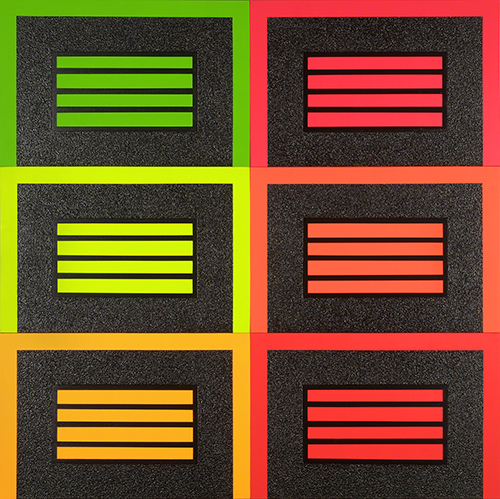 |
| Peter Halley (born 1953, US), Six Prisons, 2004. Acrylic and Roll-a-Tex on canvas, 71 15/16" x 71 15/16" (182.8 x 182.8 cm). Mint Museum, Charlotte, NC. © 2012 Peter Halley. (MIN-25) |
Halley was born in New York and received degrees from Yale and the University of New Orleans, where he taught. In the 1980s his work The Grave was the beginning of an exploration of geometric forms reminiscent of Abstract Expressionist Barnett Newman (1905–1970). Halley’s works starting in the 1990s, often in day-glow colors, elicit a sense of isolation and alienation seen in the work of many artists of the early 2000s. At the same time, the vibrant color gives the work a sense of joy. I realize the Halley’s interpretation of contemporary society is one of isolated, cold, disconnected masses, but, his work is instrumental in reasserting that even in such times, beauty emerges, and his work is a perfect example. Color rules!
Let’s look at works from the mid-1900s in which personal statement seemed to be nullified, for instance the Homage to the Square works of Josef Albers (1888–1976). I’m sorry, but I see blatant love of color harmonies in his work. Also, let’s look at some works by Ad Reinhardt (1913–1967). I so love his work and the color harmonies are sometimes so subtle! What separates these artists from Halley is their emphasis on disconnection from any human emotion, though I might add, I get emotionally excited by their works!
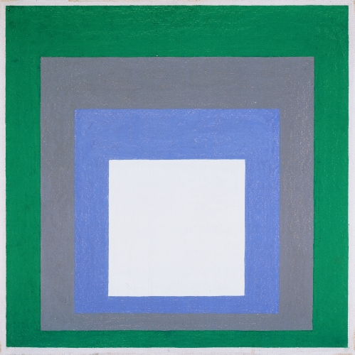 |
| Joseph Albers, Temprano from Homage to the Square, 1957. The Phillips Collection. © 2012 The Estate of Joseph Albers/The Artists Rights Society (ARS), New York. |
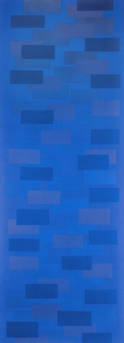 |
| Ad Reinhardt, No. 15, 1952. Albright-Knox Art Gallery. © 2012 The Estate of Ad Reinhardt/Artists Rights Society (ARS), New York. |
While many people see Minimalism as a stark, cold expression, I see it as a vibrant form of the expression of the artist’s convictions about art being, sometimes, a thesis on color, shape, or form. And if these are the artists’ convictions, what makes such works any less compelling emotionally? I sure get teary-eyed looking at Halley’s gorgeous work.
Studio activity: Geometric shapes that express an idea. On an 11" x 8 1/2" piece of heavy paper, using acrylic or watercolor paint, create a non-objective painting that expresses a point of view. Think carefully about what the main idea is, and choose geometric shapes (square, circle, triangle, rectangle, etc.) that could possibly express the idea. Make sure to choose colors to heighten the feeling about the idea of the work. It might be interesting to mount the whole class’s works on the wall side by side to see if the geometric images create a visual rhythm.
Correlations to Davis programs: Explorations in Art Grade 4: 6.35; Explorations in Art Grade 6: 5.25; A Global Pursuit; 9.4; Exploring Visual Design: 1, 4, 11; The Visual Experience: 16.8; Discovering Art History: 17.6
Comments