Calligraphy/Typeface as Abstraction
Abstraction is defined as the reduction of form to simple (geometric, or organic) or decorative (a word I hate) shapes. I’ve blogged briefly about calligraphy in the past, but I rarely get a chance to look at it for its purely decorative potential. This piece reminds me of carpet pages from medieval and Renaissance manuscripts from western Europe: extremely decorative! If anything shows the beautiful aesthetic potential of the element of art LINE, Arabic calligraphy does.
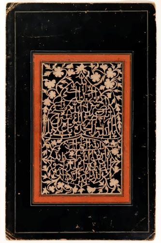 |
| Iran, Page of calligraphy, 1700s. Ink and gold leaf on paper, 12" x 7 3/4" (30.5 x 19.7 cm). © Brooklyn Museum. (BMA-2464) |
The above example shows how calligraphy can merge with floral patterns to form something akin to a logo. It reminds me of those complicated historiated initials from medieval European manuscripts. This is a capital A, beginning a sentence with “Aspiciens a longe” (I look from afar). The rest of the text begins below the initial.
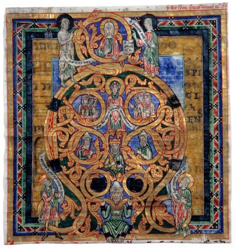 |
| Flanders, Antiphonary cutting, 1115-1125. © Cleveland Museum of Art. (CM-484) |
The importance of writing, which is emphasized throughout the Islamic holy book, the Qur’an, led to the importance of calligraphy as an art form. Cursive script dates back to the first centuries of the Muslim era. Unlike European languages, Arabic is written from right to left. In this case, from lower right to upper left. Cursive scripts were used for secular writings rather than transcriptions of the Qur’an. This page of beautiful calligraphy shows how writing – line – can be a work of art in itself. However, expressions from the Qur’an are expressed in gorgeous calligraphy.
Here’s another gorgeous example of the expressive use of contrasting lines in calligraphy:
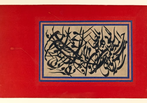 |
| Iran, Page of calligraphy, 1800s. Ink on cardboard, 4 1/2" x 7 5/16" (11.4 x 18.6 cm). © Brooklyn Museum (BMA-2465) |
 |
| Edward Fella (born 1938 US) He’s History, 1997. Lithograph, 17" x 11" (43.2 x 28 cm). The Museum of Modern Art, New York. © 2013 Edward Fella. (MOMA-P1206) |
This is an interesting comparison using more recent Western type in a similar sort of decorative configuration.
Studio activity: Making a decorative pattern of your name. Using a wide-tip maker in black, make a decorative symbol of your first/and/or last name. Practice using a pencil to make sure if geometric or organic line is preferable. After making a bold statement with your name, embellish it with colored pencils or markers making sure to interwine shapes with the bold black lines of your name.
Correlations to Davis programs: Explorations in Art 5 5.25, Explorations in Art 5 5.26, Explorations in Art 6 5.27, Explorations in Art 6 5.28, A Global Pursuit 3.4 studio, A Personal Journey 4.2, Exploring Visual Design 1
Comments