Vacation Time Activities in Art
I was on vacation recently in Provincetown and, being an art history nerd, thought I would give some visual explanations.
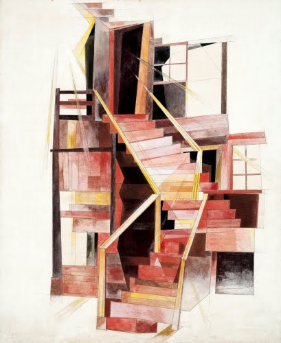 |
| Charles Demuth (1883–1935, US), Stairs, Provincetown, 1920. Gouache and pencil on board, 23 1/2" x 19 1/2" (59.7 x 49.5 cm). © The Museum of Modern Art, New York. (MOMA-P4200) |
Yes, one sees a lot of angular stairs leading up to old buildings in Ptown. These stairs look like the ones going up to the little theater above the Post Office café. Demuth was a regular member of the summer Provincetown art colony, before Abstract Expressionist mentor Hans Hofmann (1880–1966) opened his Summer School there in 1935. Although originally academically trained, Demuth abandoned that style after the 1913 Armory Show in New York, from which he absorbed the influence of Cubism.
The Provincetown art colony was established in 1899. The Ptown Art Association, which now has a museum that’s awesome, was established in 1914 and initiated the practice of yearly exhibitions of the art colony’s student work. By 1916, the colony was proclaimed by the Boston Globe as the largest one in the world with around 300 students!
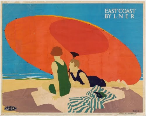 |
| Tom Purvis (1889–1959, Britain), East Coast by LNER, poster for London and Northeast Railroad, ca. 1928. Color lithograph on paper, 39 1/2" x 49 3/4" (100.3 x 126.3 cm). Image © The Museum of Modern Art, New York. (MOMA-D1049) |
I would probably be doing some of this on the beach if they have big umbrellas like this. I’m not really a beach and sun person. I’m usually laminated with 100 spf sunblock. I often wonder how hot it gets on British beaches in the summer.
England was part of the same poster renaissance as occurred in the rest of Western Europe and the US from about the 1890s to the 1940s. I extend it to the 1940s, because many of the most popular poster artists worked on public safety posters during World War II (1939–1945), including Tom Purvis. Purvis’s graphic design work is interesting, because he could produce almost photo realistic illustrations and then simplified forms like this poster.
This reduction of forms to simple areas of flat color reflects a Post-Impressionist/Cubist influence seen in many other poster artists in Britain at the time as well. Purvis’ posters for the London Northeast Railroad are among his most famous pieces.
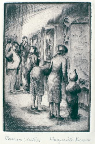 |
| Marguerite Kumm (1900–1992, US), Museum Visitors. Drypoint on paper, 3 3/16" x 2" (8 x 5 cm). Butler Institute of American Art, Youngstown, OH. (BIAA-375) |
There are so many galleries with awesome paintings and a fabulous museum, I spend most my time looking at art on vacation. I might also wander up the street and gaze fondly at the house Robert Motherwell shared with Helen Frankenthaler while I’m at it. He had to build a special door in the second floor studio of that house in order to accommodate the size of his and Frankenthaler’s canvases!
One of the best things to come out of the Great Depression (1929–1940) was the Federal Art Project (1935–1939), part of the Works Progress Administration (WPA, established 1935). This was the first ever effort by the US Federal government at arts patronage, meant to ensure the livelihood of American artists during the severe economic downturn. The printmaking program gave artists studios, printing presses and materials, and the means to disseminate affordable art to the public.
Marguerite Kumm, like Mabel Dwight, honed her printmaking skills during the Depression in the FPA. Born in California, she studied art in Minneapolis and Washington, DC. Working for the WPA, she painted murals and produced hundreds of etchings. Like Dwight, they featured everyday life of the American public.
Things I didn’t do on vacation:
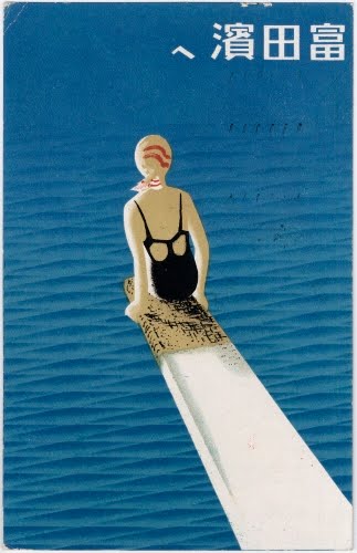 |
| Japan, To Tomita Beach post card, 1936. Color lithograph on coated paper, 5 7/16" x 3 7/16" (13.8 x 8.8 cm). © MFA, Boston. (MFAB-1081) |
Swimming. I think the history of Japanese post cards is more interesting than diving into a pool. I mean, look at the dizzying heights of this diving board. I do find the combination of Western perspective and Japanese love of pattern and asymmetrical composition fascinating, though.
The first postcards were introduced in Japan in 1873. By 1887, postcards were the most popular form of mail in Japan. They were offered in all kinds of shops, displacing the establishments that had once sold woodcut ukiyo-e prints.
In 1900, the Japanese government relinquished the publication of postcards to the private sector. This had immense impact on Japanese society. Postcards were now issued from every corner of Japanese society, including medical schools, the military, artist groups, and even department stores. The postcard made possible the rapid circulation of exciting and innovative visual vocabulary that documented how Japan was rapidly becoming a modern culture.
Subject matter of Japanese postcards during the most flourishing period (1900–1930s) varied from images of women similar to ukiyo-e prints, to scenes that symbolized the modernization of Japan.
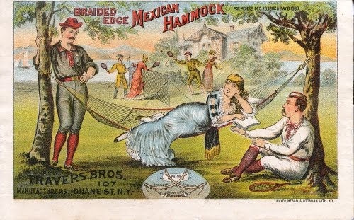 |
| Mayer, Merkel and Ottmann Lithograph Company (1874–1885 New York), Trade card for Braided Edge Mexican Hammock, ca. 1883. Color lithograph on card stock. © Winterthur Museum, Winterthur, DE. (WIN-114) |
Lounging in a hammock. I really don’t know how people take naps in a hammock. Who wants to get a waffle pattern on their backside? Did you know that in the 1800s, it was generally considered “inappropriate” for a woman to lounge in a hammock in public [unless accompanied by two male chaperons in stunning tennis (badminton?) glamour, of course]? Naturally, they would know what’s inappropriate, right? Check out the logical tennis (badminton?) outfits, especially the women’s, complete with bustle and hat. I bet one doesn’t sweat in that getup.
Trade cards like this reached their peak of popularity between the 1860s and 1890s. After the 1890s, more popular forms of advertising included magazines and posters.
Lithography greatly accelerated the evolution of graphic design, particularly for advertising. Developed in the 1790s by Alois Senefelder (1771–1834, Prague, Paris, Munich), the art form quickly replaced etching, engraving, and wood engraving as the primary source for mass-produced prints in advertising and illustration during the mid-1800s. Color or chromolithography began being perfected as early as the 1840s. The heyday of chromolithography, “everyperson’s art,” was the 1860s through the 1890s.
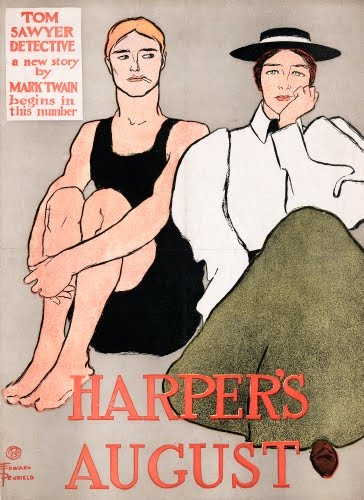 |
| Edward Penfield (1866–1925, US), Placard advertisement for Harper’s August magazine, 1896. Zinc etching on paper, 18 9/16” x 13 1/2" (47.2 x 34.3 cm). © The Museum of Modern Art, New York. (MOMA-D0573) |
Wearing a onesie bathing suit while puffing on a cigarette. Yeah, no. While I do appreciate the modesty of the onesie bathing suit, I don’t really think I’d swim off the Cape what with the possibility of being gobbled by a shark. Besides, swimming exposes me to an undue amount of sun! I’m not sure if the woman’s blasé expression in this ad is because of the onesie or the fact that the dude is smoking?
The American poster renaissance occurred at the same time as it did in Europe. It was influenced by the Arts and Crafts movement emphasis on instilling utilitarian art, i.e. advertising, with fine art. This idea—and the money to be made—led many painters to create fabulous poster art. This renaissance in poster art lasted in America through the 1930s.
Penfield studied costume and fashion design and painting at the Art Students League in New York in the late 1880s. His first job at a young age was at Harper’s magazine in 1892. A little over a year after starting he produce the first of his 75 iconic placards advertising the magazine.
Penfield was influenced by Toulouse-Lautrec and Steinlen in Paris, Beggarstaff s in England, and Japanese ukiyo-e woodblock prints. He distilled all of these influences into a style of simplified forms that established a style copied by many other poster artists of the 1890s, most notably artists like William Bradley.
Correlations to Davis programs: Explorations in Art Grade 1: 1.3, 2.12, 3.17; Explorations in Art Grade 3: 3.17, 4.21; Explorations in Art Grade 4: 2.9, 3.studio 17-18; Explorations in Art Grade 5: 5.28, 5.29, 5.Connections; Explorations in Art Grade 6: 1.3, 5.studio27-28; A Personal Journey: 2.1, 2.3, 2.4, 3.5; A Community Connection: 1.2, 4.5, 4.6, 5.4, 6.2, 7.4, 8.2; A Global Pursuit: 7.5, 8.4; Communicating Through Graphic Design 1, 2, 6; Experience Printmaking: 5, 6; Experience Painting: 4; Exploring Visual Design: 1, 2, 5, 10, 11; The Visual Experience: 3.7, 8.15, 9.3, 9,4, 13.5, 16.4, 16.6; Discovering Art History: 4.4, 15.2
Comments