
New Acquisition: Silkscreen of Walter Darby Bannard
Although I wrote a master’s thesis on Swiss Renaissance art, since then (I’m not saying how long ago that was!) I have become a big fan of the New York School that bloomed immediately following World War II (1939–1945) and established the United States as the center of modernism (and yes, it still is). I have to say that I’m torn between the color field and gestural strains of Abstract Expressionism (the granddaddy of American modernism), and I tend to gravitate toward artists who combine the two.
Although Walter Bannard is too young to have been a member of the nascent New York School, he definitely carries on the tradition of action painting/color field. Interestingly, I’m showing you a silkscreen print we recently acquired from the Buffalo AKG Art Museum in New York state.
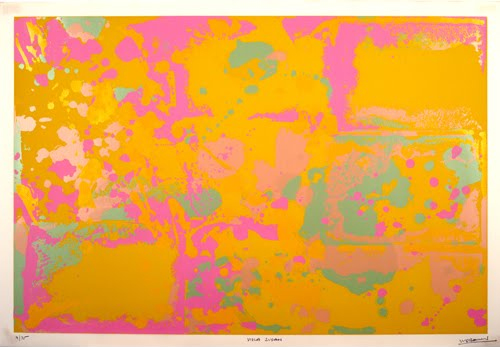 |
| Walter Darby Bannard (born 1934, United States), Viola Sudan, 1970. Silkscreen, 22 ¼" x 32 ¼" (56.51 x 81.91 cm). Albright-Knox Art Gallery, Buffalo, NY. © 2011 Walter Bannard/licensed by VAGA, New York. (AK-1597bavg) |
The medium of silkscreen is amazingly versatile, its most noted use being for posters, advertising, and tee-shirt designs. The medium can reproduce images on hard or soft surfaces. The basic technique involves a piece of finely meshed material such as silk, organdy, or polyester upon which a design is made in an impermeable medium such as glue, gesso, or a paper stencil. The material is stretched onto a frame over a piece of paper (or any other surface that can hold an ink design). Inks are forced through the material with a squeegee not covered by the impermeable material. Like relief prints, a different screen must be used for each color.
Bannard began painting seriously in the late 1950s, influenced by the color field paintings of Clyfford Still (1904–1980) and the paintings of William Baziotes (1912–1963) who had explored the idea of automatic painting (painting by subconscious impulse rather than a plan or sketch).
In the 1970s he formed his mature style of pure manipulation of color. In this print, Bannard used fish line to maintain the grid that divides the work into nine sections. In spirit, it displays the random splatters of the gestural Abstract Expressionists while conforming to the love of unemotional (lack of gesture) fields of color that characterizes the color field artists.
This painting is a good example of the Principles of Design. Show your students this work, and ask them which those might be: a) unity and variety; b) movement and rhythm; c) pattern; d) balance (asymmetrical or symmetrical); and e) emphasis.
Correlations with Davis programs: Explorations in Art Grade 4: 6.35; Explorations in Art Grade 5: 6.33; A Community Connection: 8.1, 8.2; A Global Pursuit: 4.2, 7.2; The Visual Experience: 4.4, 16.7; Discovering Art History: 3.3, 17.1, 17.3, 17.6

Comments