
Happy July 2019: Edward Penfield
What better way to celebrate a new month than with examples by one of the pioneers of the American Poster Renaissance (my term, covering the period from ca. 1890–1920, others call it the “Golden Age of American Illustration”): Edward Penfield? If any of you have a chance to visit the International Poster Gallery in Boston (460 Harrison Ave., South Boston), it is well worth it. They have absolute stacks of vintage posters to paw through. Like many art forms of the past, I feel the poster has suffered greatly at the hands of “instant gratification” online advertising. (Sigh.) Oh well, that’s a subject for another post. Let’s look at some Penfield posters!
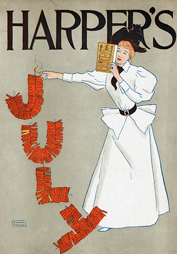 |
| Edward Penfield (1866–1925, US), Poster advertising Harper’s New Monthly Magazine, July, 1894. Etching on zinc plate on paper, 18" x 12 ½" (45.8 x 31.7 cm). © 2019 The Museum of Modern Art New York. (MOMA-P1812) |
By the beginning of the 1890s, publishers of American magazines, books, and newspapers began to commission artistic advertising posters to market their products. It marked the arrival of the modern art poster in American advertising. The “movement” was spurred on by the Arts and Crafts movement, which stressed fine art aesthetics in utilitarian works, as well as the Art Nouveau movement (an offshoot of the A&C movement), which emphasized decorative, organic line; Japanese influence; and decorative surface.
The American Poster Renaissance came at the tail end of the period called the American Renaissance (ca. 1870–1900), a period of unbridled industrial production and innovation, booming architecture and artistic patronage, vast expansion in the West opening economic opportunities, and wealth (for a few). Of course, the greedy quest for wealth by the “robber barons” (as wealthy corporate schmucks were called by the public) caused a high number of financial panics: 1873–1877 (depression), 1884, 1890, 1893–1897 (recession), and 1896. But, if you look at how cities like New York, Chicago, Saint Louis, and San Francisco boomed, it was a “Renaissance.”
Penfield’s posters epitomized the elegant, sophisticated New York look that characterizes posters of the period, all an emulation of what the artist saw in European, particularly French, posters of the period. They reflect the no-nonsense glamor of the American elite, which helped sell goods to a broad range of American consumers.
Penfield studied costume, fashion design, and painting at the Art Students League in New York in the late 1880s. His first job at a young age was at Harper’s magazine in 1892. A little over a year after starting, he produced the first of his seventy-five iconic placards advertising the magazine.
Penfield was aware of Henri de Toulouse-Lautrec (1864–1901) and Théophile Steinlen (1859–1923, Swiss) in Paris, the Beggarstaffs (William Nicholson, 1872–1949, and James Pryde, 1866–1941) in England, and Japanese ukiyo-e woodblock prints. This came only after he had become the art director of Harper's in 1892, and after he had already created his iconic “Harper's woman,” seen in the advertisement above. This figure, composed overnight on impulse for a presentation, became the new face of the magazine, and influenced subsequent graphic designers, particularly the likes of Will Bradley (1868–1962, US).
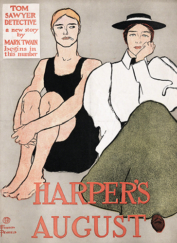 |
| Edward Penfield, Poster for Harper’s August, August 1896. Zinc plate etching on paper, 18 9/16" x 13 ½" (47.2 x 34.3 cm). © 2019 The Museum of Modern Art New York. (MOMA-D0573) |
Although men figured in some of Penfield’s designs, it was really the “Harper’s Woman” that dominated the majority of his posters. Unlike the often scantily clad, nymph-like female figures used to sell products in French posters, Penfield’s women reflected the ideal of the American middle-class woman. It summed up what was considered at the time to be the “new American woman”—fashionable, educated, possibly working (gasp), and urban. I’m not sure how this image sold in Dodge City, Kansas.
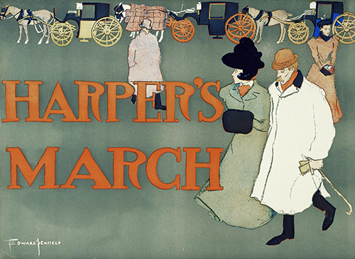 |
| Edward Penfield, Poster for Harper’s March, March, 1897. Color lithograph on paper, 18 7/8" x 13 7/8" (47.9 x 35.2 cm). © 2019 The Museum of Modern Art, New York. (MOMA-D0817) |
In most of Penfield’s works, the figures are isolated on a stark, neutral background, even when the figures are supposed to be in a setting such as a park or an omnibus. If this line of carriages as a backdrop with prominent figures in an otherwise blank picture plane look familiar, it recurs in Pierre Bonnard's Nannies' Promenade, Frieze of Carriages from 1899. Both artists show the Post-Impressionist preference for simple shapes and flat color to define form, and a Japanese print-influenced open composition and asymmetrical arrangement of key elements of the subject.
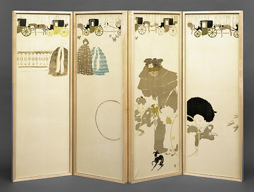 |
| Pierre Bonnard (1867–1947, France), Nannies’ Promenade, Frieze of Carriages, 1899. Lithograph on paper mounted on four wooden panels as a screen, height: 54" (137.16 cm). The Museum of Modern Art, New York. © 2019 Artists Rights Society (ARS), New York. (MOMA-P1815boars) |
Correlations to Davis Programs: Explorations in Art 1E Grade 3: 3.17; Explorations in Art 2E Grade 3: 3.7; Explorations in Art 1E Grade 6: 5.27; Explorations in Art 2E Grade 6: 5.6; A Personal Journey 2E: 4.3; Communicating through Graphic Design: 3, 6
Comments