
World Bicycle Day: Josef Müller-Brockmann
Starting in the late 1800s, posters began to be designed by fine artists, and what ensued what has been called the Poster Renaissance. After World War II, Swiss artists developed the International Typographical Style which incorporated photography a great deal. World Bicycle Day was declared for 3 June by the United Nations in 2018. Street lanes dedicated for bicycles and bicycle safety are major promotions of this day.
World Bicycle Day 3 June: Art by Josef Müller-Brockmann (1914–1996, Switzerland)
Josef Mueller-Brockman was a graphic designer who was one of the pioneers of the Swiss Design style.
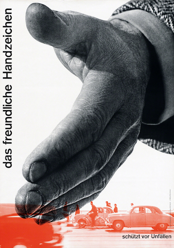 |
| Josef Müller-Brockmann, The Friendly Hand Signal, Protection from Accidents, poster, 1954. Offset color lithography on paper, 128 x 90 cm. The Museum of Modern Art, New York. © 2025 Artist Estate / Artists Rights Society (ARS), New York. (MOMA-P3183jmbars) |
For five years, after winning a competition in 1953, Müller-Brockmann produced safety posters and brochures for the Zurich Automobile Club using photo montage techniques. These powerful images were unambiguous in their statements, their effectiveness leading to further commissions. In these posters he combined photography with the dynamic layout rules of Constructivism and his own strict, clean style. This poster advocates directional hand signals from bicyclists. As in many of the posters in the series, Müller-Brockmann draws the viewer's eye through the image by virtue of a powerful diagonal, in this case a hand that is literally cutting through a stream of traffic. Right under the hand are bicyclists, the theme of the poster -- hand signals while riding a bicycle in traffic to which auto drivers should be aware.
The poster design "renaissance" of the late 1800s to early 1900s ended in the 1930s. The brilliant designs of both professional designers and fine artists before World War II (1939–1945) had incorporated into poster design aspects of contemporary art movements such as Art Nouveau, Art Deco, and Art Moderne, and many types of geometric abstraction. Many of these styles end up in the service of war propaganda posters, the dominant genre of war posters.
After the war, designers in Europe made a conscious effort to create a modern graphic design that was neutral, objective, and lacked individual expression. They stressed international appeal and a process based in the optimistic attitude about technological and social advancement. Swiss and German designers were particularly interested in a "canonized" (set of standards) modernist graphic design. The movement resulted in what was called Swiss Design, or the International Typographical Style.
The designers of the International Typographical Style preferred photography as a sources of imagery because of its machine-produced precision, and its lack of personal input by the photographer. Asymmetrical layouts were popular, as was a return to sans-serif typefaces, a favorite of pre-war designers. Posters contained elements of harmony and simplicity, considered appropriate symbols of the post-war boom in science and technology.
Müller-Brockmann is considered one of the developers of the Swiss Design look. He was born in Rapperswil, Sankt Gallen. He studied graphic design and architecture at the Zurich School of Artis and Crafts. In 1934 he apprenticed as a graphic designer, and in 1936 he opened up his own studio in Zurich. In 1937 he joined the Swiss Association of Artists and Designers. After 1945 he concentrated on illustration and exhibition design.
The work of Müller-Brockmann is rooted in both Constructivist and Minimalist aesthetics: understated but informative. He was a co-editor of Neue Graphik magazine, which spread the principles of Swiss Design. He taught graphic design at a number of schools in both Switzerland and Germany. He also wrote books on graphic design including Grid System in Graphic Design and The Graphic Design Artist and his Design Problems.
Comments